What lies ahead — 08
A forest for a fox: the new home of Liska
Liska is a cheeky little fox drawn by artist and tattooist Petya Evlogieva, with hundreds of drawings and four books of her own. Her new site is a warm, hand-drawn home where the drawings lead and everything else stays quiet. Here is what went into it, from a forest that changes with the seasons to a button you must never press.
01
A fox who outgrew her folder
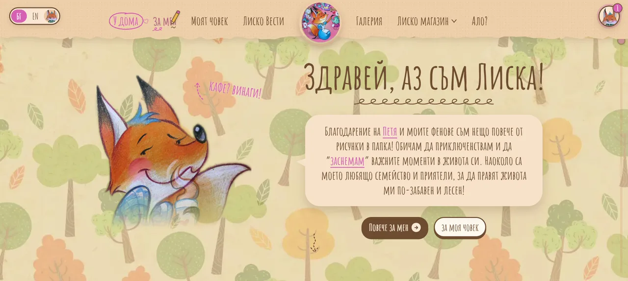
Liska is a fox. An orange, curious, slightly cheeky fox with a blue tuft of hair and a weakness for coffee. She was drawn by Petya Evlogieva, an artist and tattooist, and over the years she has grown from a character in a sketchbook into a Facebook page with real fans, a gallery of hundreds of drawings and a series of illustrated books. The newest, Наново, is the fourth.
She introduces herself on the first screen of the site, in her own words: thanks to Petya and her fans, she is more than drawings in a folder. She loves adventures, and she likes to "photograph" the important moments of her life.
The site's title says what it is for: Лиска – Новият ми дом. Liska, my new home. The redesign had one job, to make that home feel like her. Warm, handwritten and playful, in Bulgarian and English, with a shop that simply works: pick a book, pay when it arrives. And with room to keep growing, for the news, the gallery and whichever book comes next.
02
Her forest, in every season
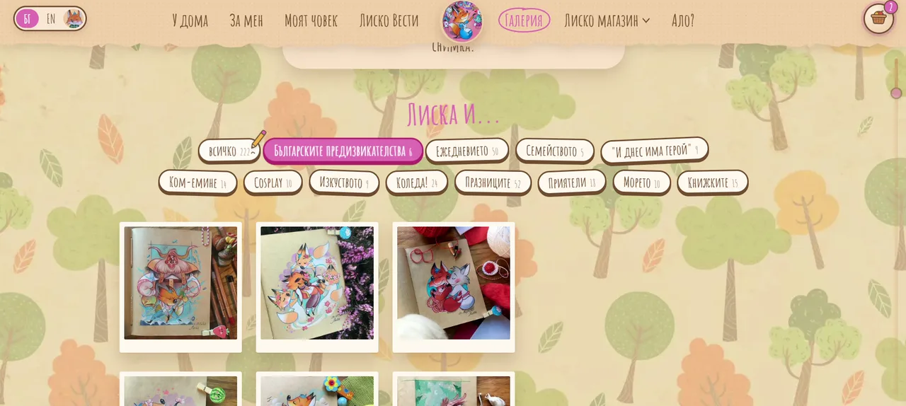
Liska's world was already there in the drawings: a forest of round, crayon-textured trees in soft greens and oranges.
So every page of the site sits in that forest. The background is a pattern rebuilt from the original drawing, and it repeats without a single visible join, so it never looks like wallpaper. That sounds like a small technical detail. It is the difference between a page with a forest printed on it and a page that is in a forest.
The forest also changes. It follows the seasons in Bulgaria: snowy and pale blue in winter, in pink blossom in spring, deep green under a hazy sun in summer, gold and orange in autumn. It changes on its own, with the calendar. And because people love to play, a little menu asks "Кой сезон да е?", which season should it be, so a visitor in November can walk through Liska's spring if they want to.
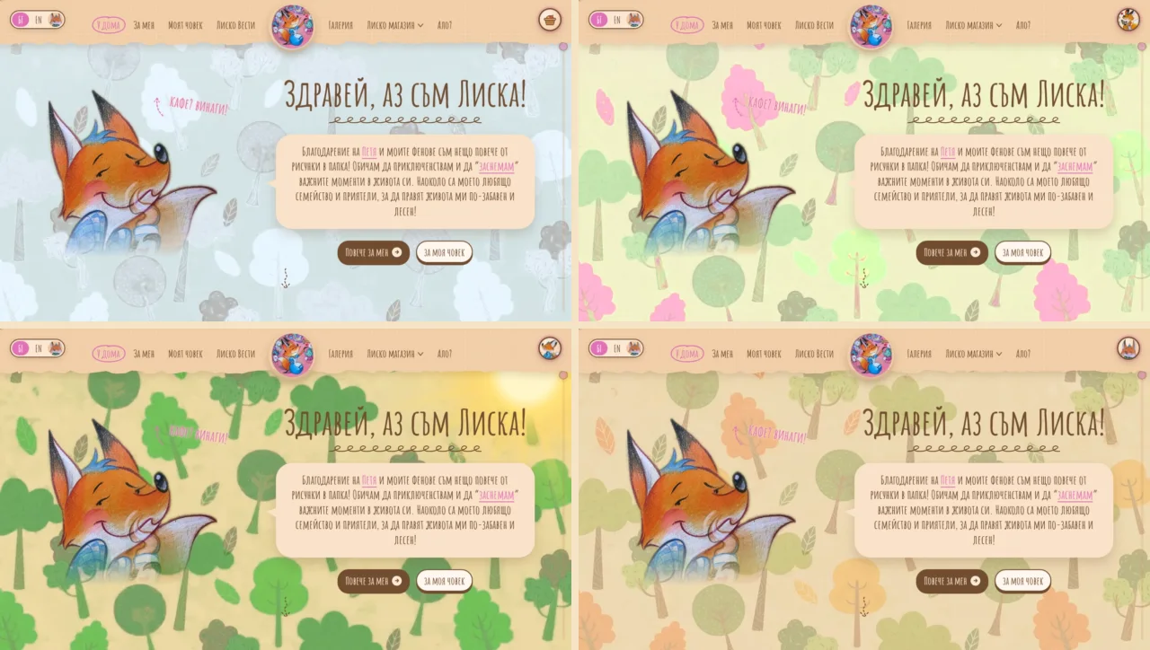
A fan who comes back in March sees a different forest from the one they saw at Christmas. Nothing else on the page has changed, and yet the site feels alive, the way a place you visit often feels a little different every time.
03
Paper, pencil and a portrait
Everything around the drawings looks as if it could have been made by hand.
The header is a strip of torn, dotted paper with Liska's round portrait in the middle. On every page, the strip unfolds from that portrait, and moving from one page to the next feels like folding up a note and opening another. The type is Amatic SC, a tall, hand-drawn capital that looks written with a felt-tip pen, used for everything from the headlines to the prices.
Headlines write themselves letter by letter, as if someone were writing them while you watch. Under them, curly lines draw themselves, like a pen flourish under a title in a notebook. And the cursor is a pencil, which gives a little wiggle over anything you can click.
Liska herself turns up where she belongs. She peeks out of the basket. She strolls along the footer. She walks across the menu on a phone. Never in the way, never asking for attention, always somewhere you would expect a fox to be hiding.
04
The drawings lead
The most important design decision on the site is also the least visible one: the drawings come first, and everything else steps back.
The drawings already have all the personality a page could need. Anything that competes with them, such as tape, stickers, tilted photos or decorations that never stop moving, only makes them harder to see. So there is none of that. The drawings hang straight, and they carry each page. On the home page, Liska's adventures are pinned to a clothesline like polaroids, straight and even, sliding slowly past.
When the work is art, the site is the frame, not the painting.
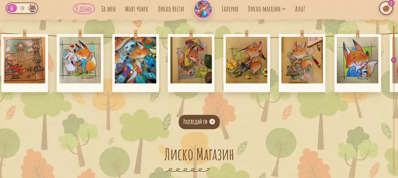
The motion follows the same rule. Every effect is small and has a job. Headlines write themselves once, as a page opens. Curly lines draw themselves once. The pencil wiggles only when there is something to click. Nothing loops forever in the corner of your eye, so when something does move, it means something.
05
A voice in every corner
The drawings set the look. The voice is Liska's, and the site lets her speak everywhere, even in the places where most sites go quiet.
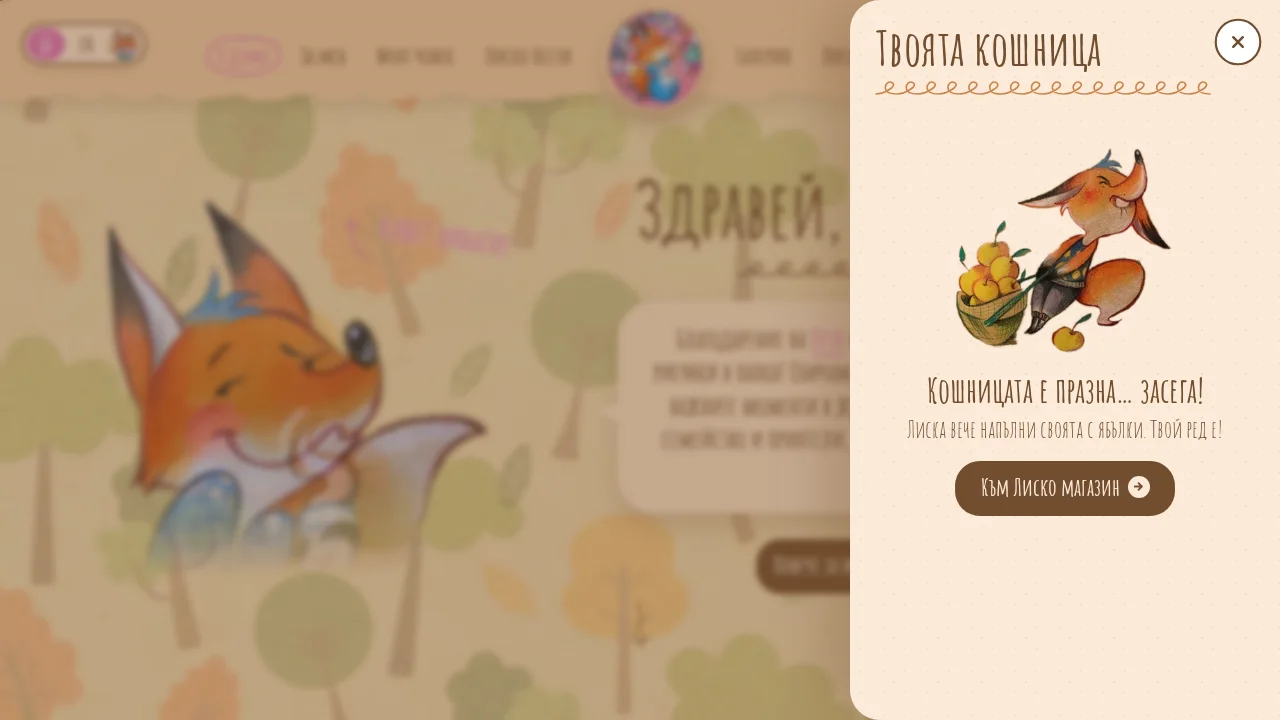
The contacts page is called "Ало?", the way you answer the phone. The checkout is "Лиско каса", Liska's till. Open the basket before you have added anything, and Liska is standing next to her own basket, already full of apples: the basket is empty… for now! Liska already filled hers with apples. Your turn!
The cookie banner, the screen everybody hates, opens with "Бисквитка?". A cookie? Liska adores cookies, she says, but the ones on this site are boring: without them, the basket does not work. If you allow it, the site will also remember where you came from, Facebook or Google, just so she knows who is sending her guests. No ads, on her honest fox's word.
The footer thanks you for peeking into her den and tells you to come back, because the coffee is always warm. The privacy and cookie pages sit under a heading that admits they are the boring stuff, but important. The copyright line asks you not to swipe the drawings without asking. Even the order emails are written in her voice. And if you land on a page that does not exist, Liska apologises: she must have misplaced it somewhere.
None of this costs anything to load. All of it makes people smile. It is also the strongest brand rule a character site can have: if Liska would not say it, the site does not say it.
06
The button you must not press
On the About page there is a big red button, and above it a heading that pleads: please don't press the button! Underneath, smaller: seriously. No.
Of course you press it.
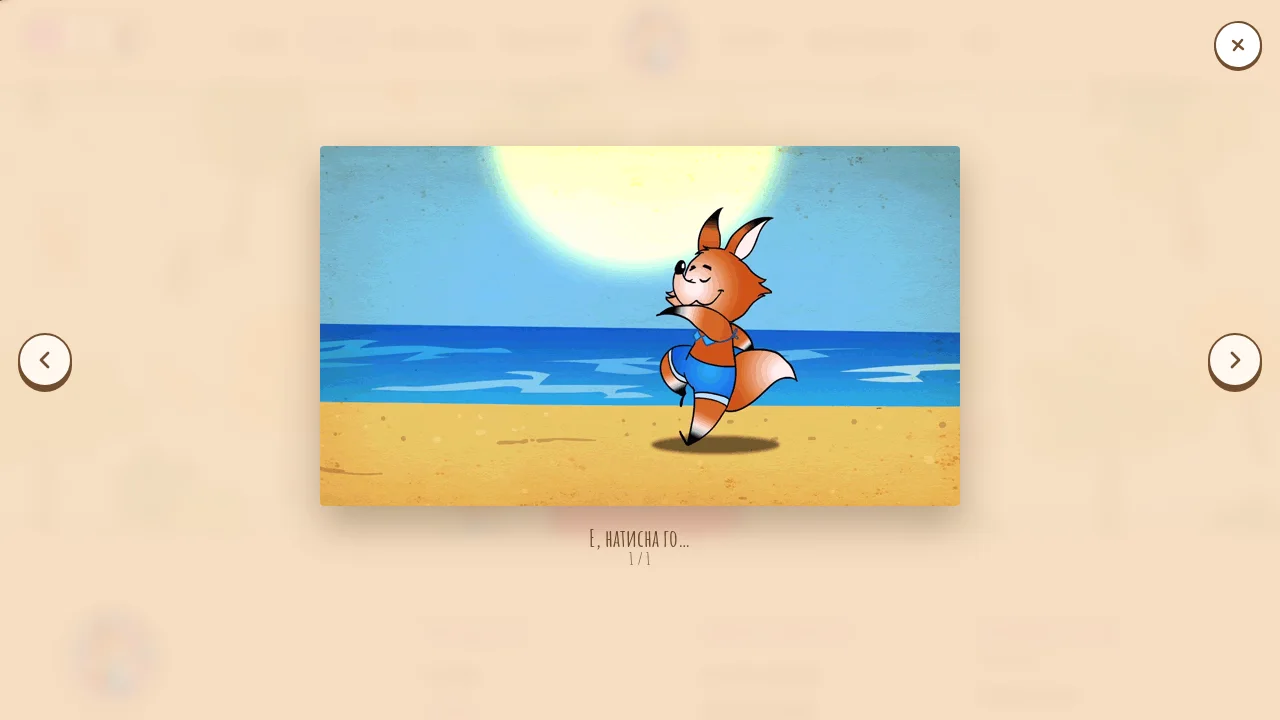
The heading rewrites itself, letter by letter, into "I told you not to press it!", and a framed lightbox opens with an animated Liska, dancing on a sunny beach, captioned "Well, you pressed it…".
A little further up the same page sits a heart and a question: how many likes will I collect? Press the heart, she says, as many times as you like.
These are tiny things, and they are exactly what fans share. A good character site rewards curiosity, because curiosity is what Liska is about.
07
A shop that simply works
Under the charm, this is a real shop, and it is built to work without anyone having to think about it.
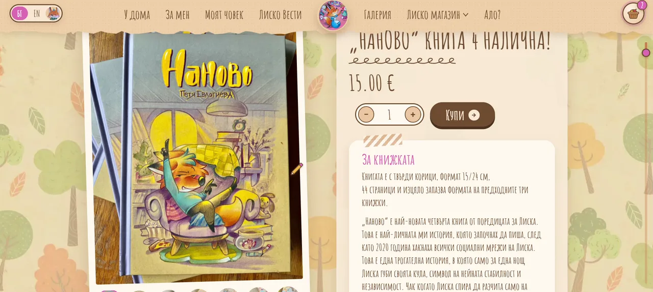
Лиско магазин, Liska's shop, is where her books live. Each book has its own page, with photos, the price and a short note about the book. Наново, the newest, is a hardback in 15 by 24 centimetres with 44 pages, in the same format as the three books before it.
A slide-out basket waits on every page, so you never lose your place. Delivery goes by Econt, Speedy or courier to the door, and customers pay on delivery, which is how much of Bulgaria still prefers to shop. The footer says it plainly: you pay when the book arrives. There is a customer account for anyone who wants one, and the order emails arrive in Liska's voice.
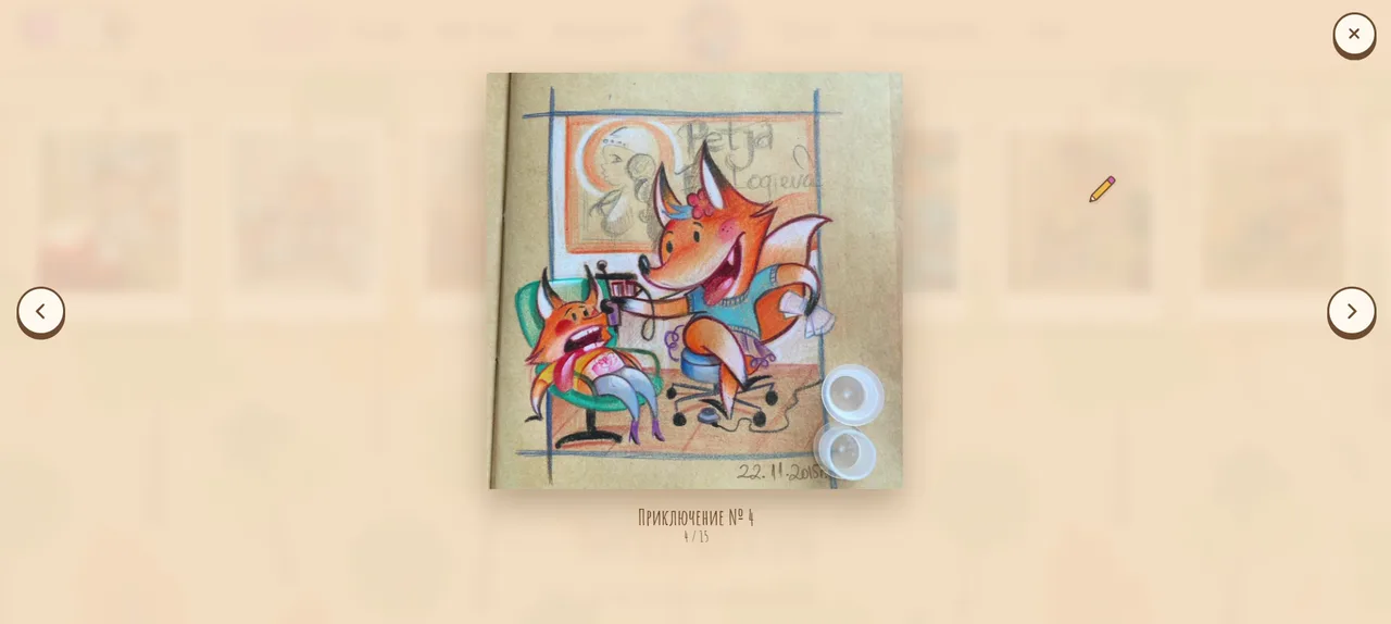
The gallery is the other big room. It holds 222 drawings, sorted into twelve sets, from the Bulgarian challenges and everyday life to family, cosplay, Christmas, friends and the sea. Each set has its own filter, and every drawing opens in a framed lightbox, like a picture on a wall.
The site speaks Bulgarian and English throughout, and even the language switch is in character: it has its own page, Liska the Polyglot.
08
Out with the page builder
Underneath it all are WordPress and WooCommerce, but the page builder no longer draws the pages.
Every template, from the gallery and the book pages to the basket, checkout, thank-you page, customer account and order emails, is custom-built in one small plugin. That is why everything looks like one family: every page was designed together, rather than assembled from someone else's blocks. It is also why the site can keep growing, because the next book or the next gallery set drops into templates that already know what Liska looks like.
Like every site in the MP13 portfolio today, it is AI-coded with human direction. AI agents wrote the code. The decisions about how it should look, feel and sound were made by a person.
The privacy and cookie pages are written in both languages, and the shop only notes where an order came from after a visitor has said yes. Being honest with fans is part of being a character they trust.
09
What makes it work
The ideas behind the site, in short:
- The art leads. The site is the frame, and the drawings always win.
- Every effect has a job. Motion plays once, with a reason, and nothing loops forever.
- The character speaks everywhere. The basket, the cookie banner, the footer and the 404 page all sound like Liska.
- The place changes. A forest that follows the seasons gives people a reason to come back.
- Curiosity is rewarded. One button you must not press is worth a page of marketing copy.
- The shop stays simple. The basket is always at hand, and you pay when the book arrives.
10
Visit the den
Liska's new home is live at лиска.com, in Bulgarian and English. Try the season menu, press the heart, and whatever you do, do not press the red button. You can watch the full walkthrough in the Liska case study.
And if you have a character, a brand or a body of work with a personality of its own, and your site is not letting it speak, tell me about it. There is always a version of your site that sounds like you.