What lies ahead — 07
One red line: designing a website for a financial analyst
Kliment Robev writes about markets for Forbes Bulgaria, explains them on Bloomberg TV and is writing a PhD on pensions. His new site had to hold all of that and feel the way a good analyst thinks: calm, exact and in no hurry. Here is how I designed it, from the colour of the paper to a cookie banner that asks you to buy or sell.
01
Finance has a look, and it is tired
You know the look before the page loads. Navy and gold. A city skyline at dusk. Two hands shaking over a desk. A ticker running green and red across the top, and a laptop with a chart on it that nobody is reading.
The visual language of finance was built to signal trust. Because everyone uses it, it now signals nothing. Worse, it signals selling. It is the look of someone with a product to push and a target to hit.
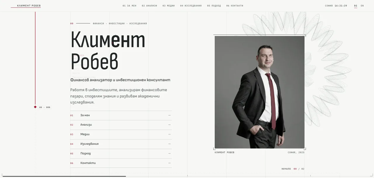
Kliment Robev is not selling a product. His work is thinking. He writes analysis for Forbes Bulgaria, he explains the markets on Bloomberg TV Bulgaria, he talks investing on a podcast, he gives lectures and webinars, and he is writing a doctoral thesis on whether better investment results can turn into more adequate pensions. His own one-line summary, on the first screen of the site, says it plainly: he works in investing, analyses financial markets, shares what he knows and pursues academic research.
So the brief was not "make a finance website". It was: make a site that feels like reading his work. In finance, calm is the real luxury. Anyone can shout about returns. The person you trust with your money is the one who does not hurry.
02
A report, not a brochure
The idea that shaped everything was simple. Design the site like a well-made research report, the kind of document an analyst is proud to put his name on. Paper, ink, numbered chapters, figure labels and a summary at the top.
Once you see it that way, the details follow. Every section has a number, from 00 to 06, like the chapters of a report. Small monospaced labels sit above the headings: Finance · Investing · Research. The portrait on the first screen has a caption, like a plate in a book: Kliment Robev, Sofia, 2025. A counter in the corner says where you are: Home, 00 / 02. The topic cards are numbered T.01 to T.09. The chart in the research section is labelled Fig. 2.
The palette is paper and ink. An off-white that is warm without being cream, a graphite that is softer than black, a quiet grey for anything secondary, and one deep red. It is the same red as the tie in his portrait, and it is the only colour on the site. Behind everything runs a faint grid of hairlines, like the columns of a layout sheet, so the page always feels set rather than placed.
03
Type that speaks Bulgarian
The headlines are set in Sofia Sans Condensed. It is tall and narrow, confident without shouting, and it can hold a long Bulgarian word like Изследвания at a large size without breaking the line. The reading text is Sofia Sans, from the same family. Labels, dates, numbers and readouts are in IBM Plex Mono, which gives the data its own voice, the voice of a terminal or a footnote.
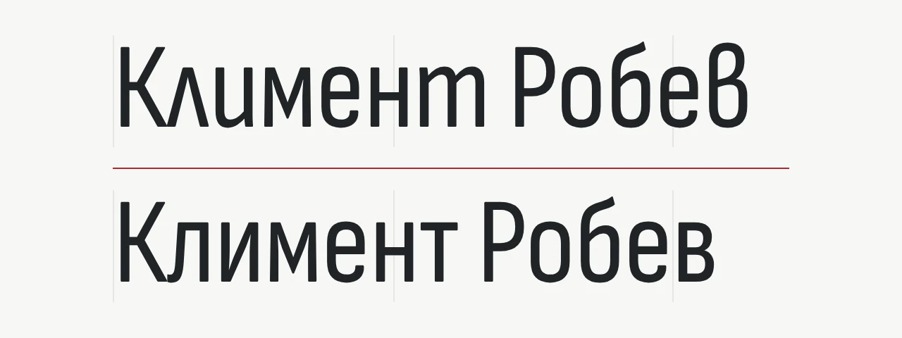
There is a detail here that most visitors will never name and every Bulgarian reader will feel. Bulgarian Cyrillic has its own letterforms. In Bulgarian handwriting and modern Bulgarian typography, л looks closer to a Greek lambda, т looks like a Latin m, and в has a rounder, more open shape. The Russian forms, which most fonts show by default, are more upright and blocky.
Good fonts carry both sets and switch between them by language. But they only switch if the page tells them what language it is in, and most Bulgarian websites never do. So Bulgarian readers spend their days reading their own language in Russian shapes.
On klimentrobev.com the page says it is Bulgarian, and the type answers. The headings read the way Bulgarians write.
The type also carries the motion. Headings arrive in a hairline weight and settle into their regular weight as they come into view, using the font's variable weight axis. It is a small gesture, like ink settling into paper, and it is about as loud as the motion on this site ever gets.
04
One red line
If the site has a signature, it is a single red line.
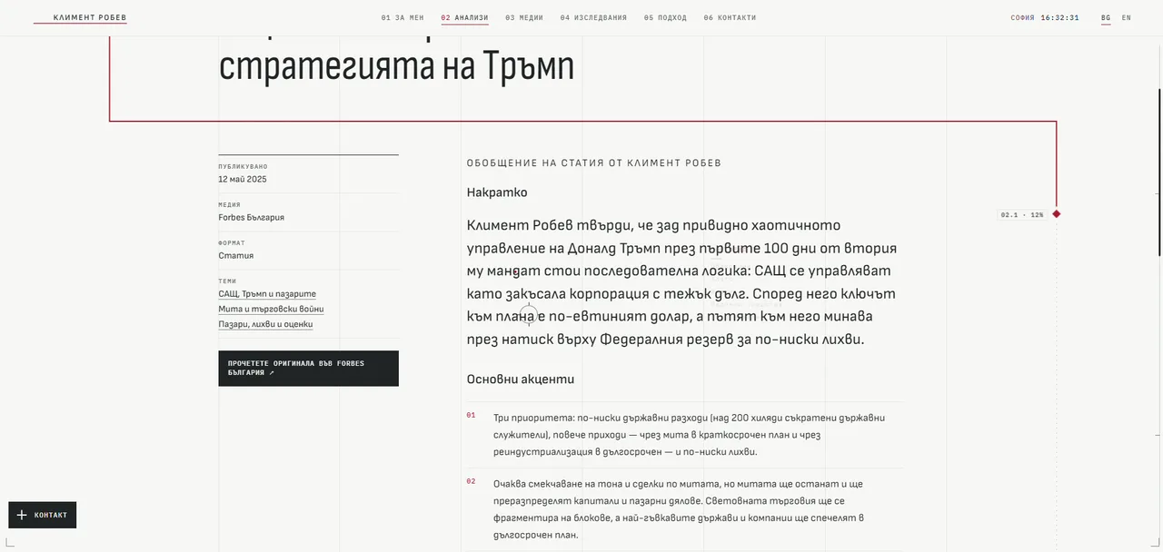
It runs down the left side of every page. When you scroll into a new section, it turns the corner and frames it, then carries on down, like the line on a chart finding its next point. A small red diamond rides along it with a readout beside it: the section you are in and how much of the page you have read, for example 02.1 · 12%. Along the bottom, a thin bar fills as you go.
Even the scrollbar belongs to it. The browser's own bar is replaced by a slim rail with a tick for every section, so you can jump straight to the chapter you want.
There are two reasons the line is there. The practical one is that this is a site for long reading. Articles, research, a biography: long pages need a sense of place, and the line tells you where you are without asking you to look for it.
The other reason is that a line is the most familiar shape in finance. A price over time. Everyone who has looked at a market has followed a line across a screen. Here the line is your reading over time. And because red is the only colour on the site, your eye follows it without being told to.
05
Clocks, an engraving and a market watch
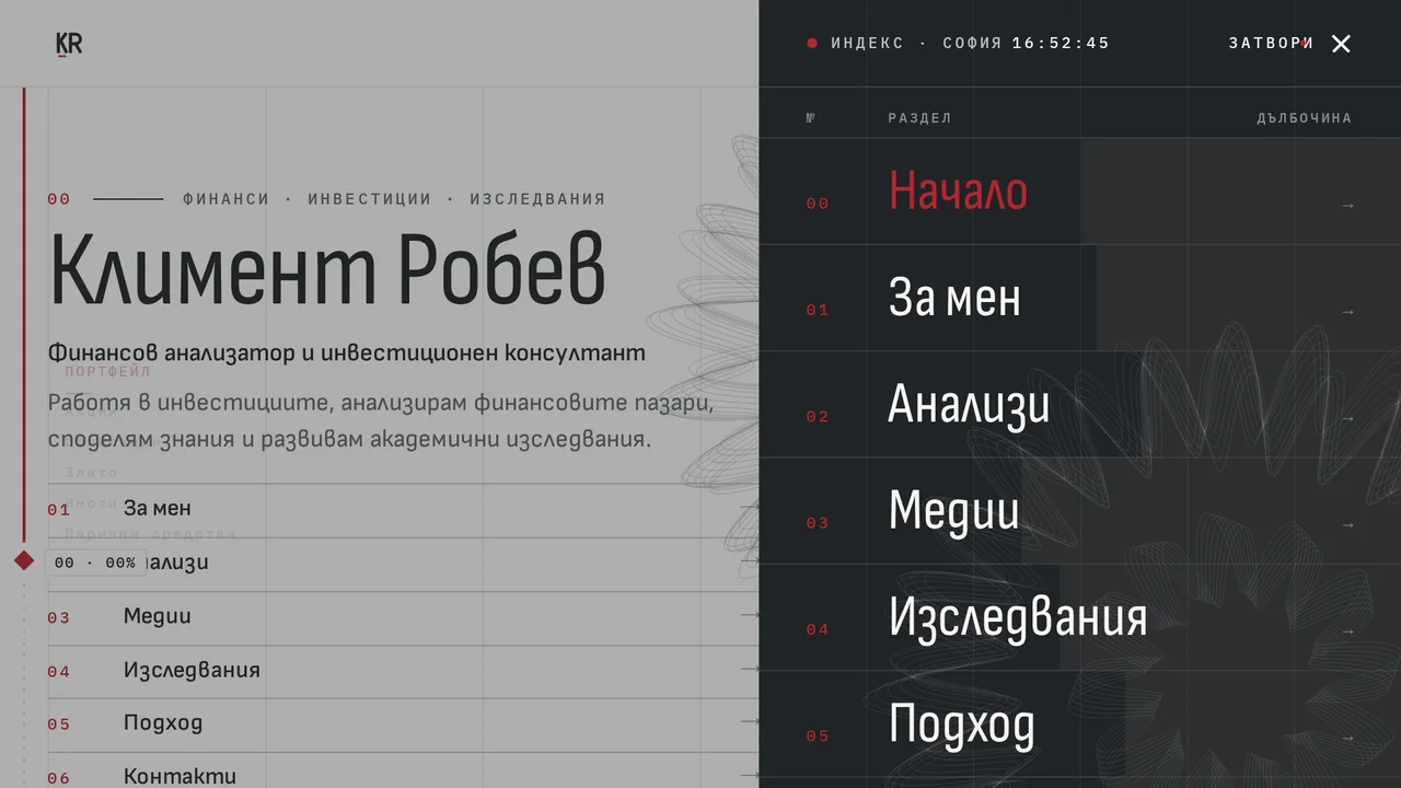
The header keeps a live clock: Sofia, to the second. Open the menu and it becomes an index on a graphite panel, with columns for number, section and depth, like the contents page of a report. Further down sits a row titled Markets · local time, with clocks for Sofia, Frankfurt, London, New York and Tokyo. The same five clocks close every page in the footer.
Someone who follows markets lives across time zones. The clocks say that without a word of copy.
Behind the first screen there is a fine-line rosette, a guilloché drawn in grey hairlines, like the engraving on banknotes and share certificates. It sits there almost like a watermark. The site's About page says his career began in securities trading, and the engraving is a quiet nod to that world.
Then there is the market watch, my favourite detail on the site. Every so often, a short watchlist fades in along one of the grid lines, drifts down a little and dissolves. First an asset class in red, then the instruments a private-client desk follows in it. Equities: S&P 500, DAX, FTSE 100, SOFIX. Bonds: the US ten-year, the Bund, the gilt. Commodities: gold, silver, Brent.
Names only. No prices, no arrows, no percentages, so nothing on the page ever pretends to be live market data. It is atmosphere, not information, and it is honest about being atmosphere. It switches off for anyone who has asked their device for less motion, and when no list is showing, nothing runs at all.
06
A lot of material, in order
Kliment produces a lot. Columns, television, podcasts, lectures, papers. The real design work on a site like this is not the hero. It is deciding where everything lives, so that a reader finds what they came for in two clicks.
The site has five rooms:
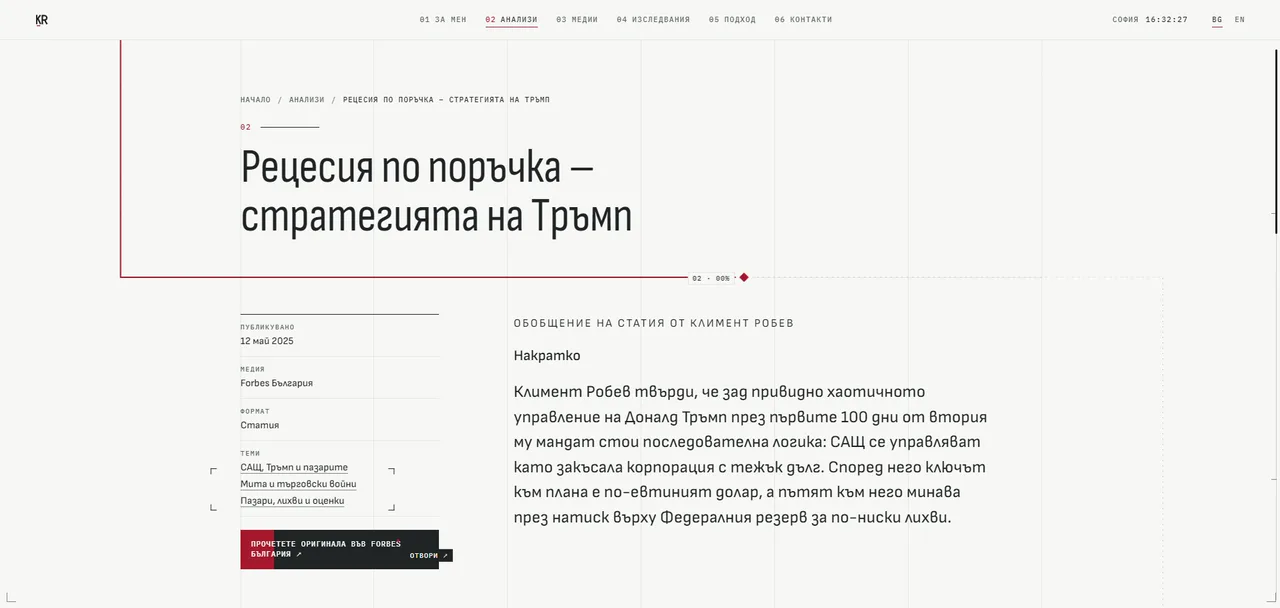
- Insights. His articles, each with its own page. The page gives the date, the publication, the format and the topics, then a short summary of the article, the key points in a numbered list, and a button to read the original in Forbes Bulgaria.
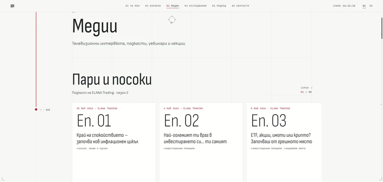
- Media. Four drawers: articles, television, podcasts, and talks and events. Interviews on Bloomberg TV Bulgaria, the ELANA Trading podcast Пари и посоки, webinars, a summer school on investing and a conference panel he moderated.
- Research. The doctoral work on Bulgaria's pension system, his scientific publications and the chart I will come back to in a moment.
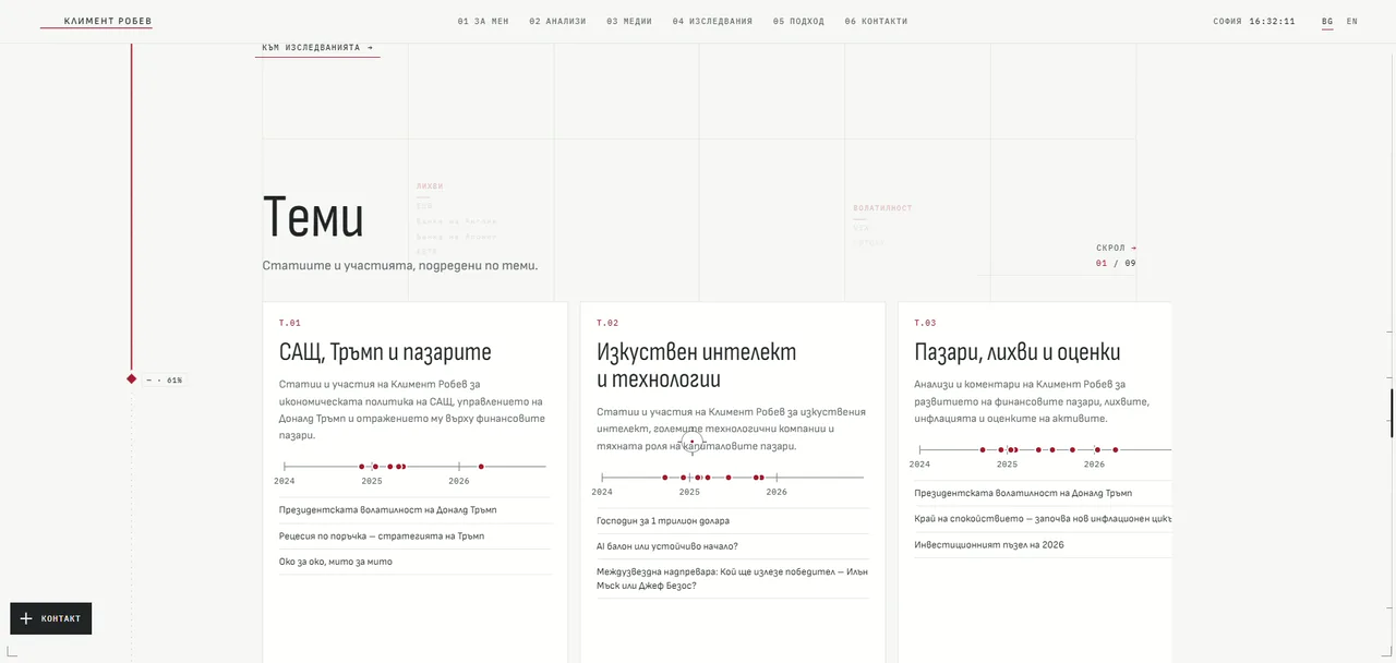
- Topics. Nine themes, from The US, Trump & Markets to Pensions & Personal Finance. Each card shows a timeline from 2024 to 2026 with a dot for every piece, the latest titles and how many items it holds. The cards sit in a row you scroll sideways.
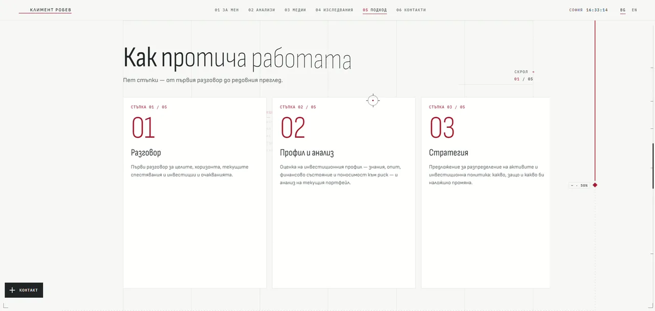
- Approach. How he works with private clients, in five steps.
Two decisions here matter more than they look.
The first is the summaries. The site does not copy anyone's article. It summarises it in a few lines, lists the key points, and sends the reader to the original. That is fair to the publisher, it is useful to the reader, and it gives every article a proper page of its own that search engines can understand.
The second is that a piece can live in more than one topic. His article on Donald Trump's presidential volatility belongs to US politics and to markets and rates, so it appears in both. A reader who arrives curious about AI can follow his thinking on AI from piece to piece, without needing to know where each one first appeared.
07
A chart that tells the truth
The research section has one chart, and it is the most honest chart I know.
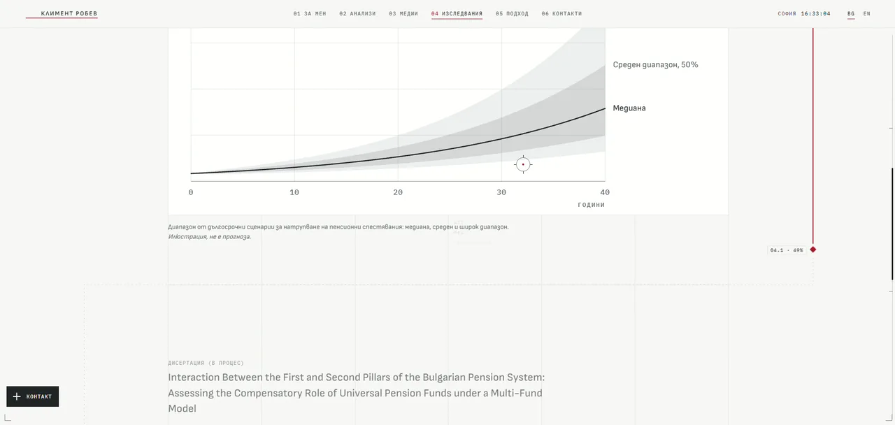
It is a fan chart of long-term savings scenarios over 40 years. A single line shows the median. Around it, a darker band shows the middle range, where half of the outcomes fall, and a lighter band shows the wide range, which covers 80 per cent of them. The further into the future you look, the wider the fan opens.
In finance, a single confident line drawn into the future is usually a lie. A fan says something truer: here is the likely range, and it gets less certain the further out you go. That fits his own approach. On the Approach page he writes that markets will always surprise us, and that the point of a process is that surprises never force decisions under pressure.
So the chart is drawn in the site's own ink: greys for the ranges, one dark line for the median, and nothing to make it look more exciting than it is.
The Approach page follows the same spirit. Five steps, from the first conversation to the regular review: conversation, profile and analysis, strategy, implementation, review. No promises of returns, no countdown timers, no "book your free call now". Just how the work is done.
08
Two languages, one voice
The site is in Bulgarian and English, with a switch in the header and every page in both languages.
The interesting part is the titles. His articles and episodes were published in Bulgarian, so the English version keeps the original Bulgarian title and adds an English line underneath. A reader sees Президентската волатилност на Доналд Тръмп with "Donald Trump's presidential volatility" below it. It tells the English reader exactly what the piece is about, and it does not pretend that Forbes Bulgaria published it in English.
The footer carries the less glamorous pages an investment professional needs: regulatory information, privacy and the cookie policy. They are set in the same type, with the same care, because trust is built in the boring places too.
09
A cookie banner that trades
Every site has to ask about cookies, and almost nobody reads the question. On most sites it is the most irritating moment of the visit.
On this one it is a market order. The panel is headed Market order · Cookies, № 001. Below it, like the lines of an order ticket: Instrument, Cookies. Statistics, Optional. YouTube videos, Optional. Advertising, None. Then two buttons. Buy: accept all. Sell: essentials only.
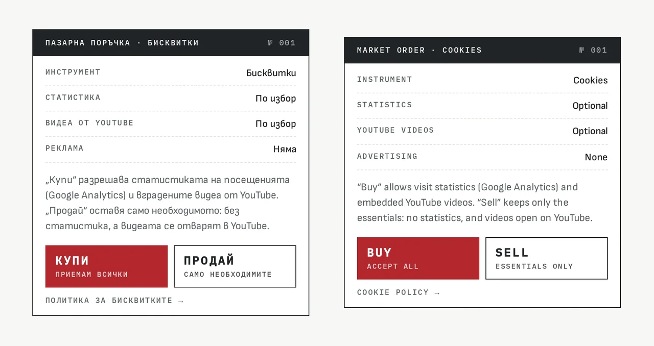
The joke works because it does not hide anything. A plain sentence explains exactly what each choice does: Buy allows visit statistics through Google Analytics and embedded YouTube videos, while Sell keeps only the essentials, so there are no statistics and videos open on YouTube instead. Both choices are one click. The wit is in the frame, never in the fine print.
That is the line I try to hold whenever a site has a sense of humour. Play with the form as much as you like. Never play with the facts.
10
Quiet is harder
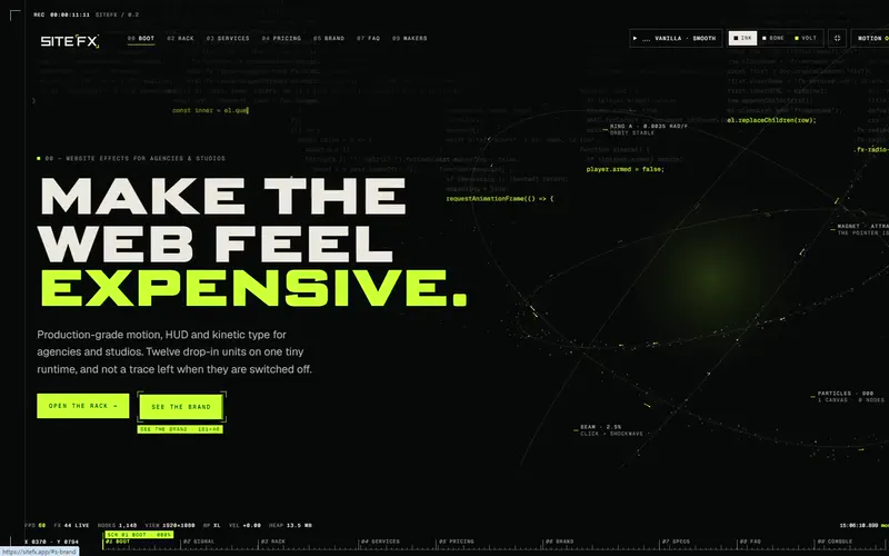
If you have read the posts about Cyberpunk mode or SiteFX, you know I enjoy the loud side of the web. This project is the opposite, and quiet is harder.
On a loud site, effects can cover a weak decision. On a quiet site, nothing covers anything. Every hairline, every gap between a label and a heading, every weight of every word is on show. If the spacing is off by a few pixels, the whole report looks careless.
The site is AI-coded, with a human touch and human design, like everything I make now. The AI wrote the code: smooth scrolling with Lenis, the scroll scenes with GSAP and ScrollTrigger, the headings split into lines, the readout that knows which section you are in and how far you have read, the five clocks keeping five markets on their own time, the market watch, and the topic rows that scroll sideways. Working with AI, all of that becomes a conversation: I describe, it builds, we test, I refine.
What the AI did not do is decide. It did not decide that there should be only one line, and only one red. It did not decide that Bulgarian readers deserve Bulgarian letters, that a cookie banner could be an order ticket, or that a watchlist should show names and never invent a price. The AI can build a red line that follows you in an afternoon. Deciding that there should be only one is the design.
The AI can build a red line that follows you in an afternoon. Deciding that there should be only one is the design.
11
What I took from it
A few lessons I will keep:
- Design the way your client thinks. Kliment thinks in processes, ranges and evidence. A report suits him far better than a brochure ever could.
- One accent, earned. A single red means something every time it appears. Two colours would have meant nothing.
- Give long reading a sense of place. A line and a percentage are enough to keep a reader oriented on a long page.
- Let the language be the language. Declare it properly, and Bulgarian type will look Bulgarian.
- Summarise and link, do not copy. It is fairer, more useful and better for search.
- Make the boring parts in character. The cookie banner, the menu and the footer are part of the brand too.
12
Read the report
The site is live at klimentrobev.com, in Bulgarian and English. Scroll slowly and watch the line. You can also see the full walkthrough in the Kliment Robev case study.
And if you are an expert whose work is scattered across articles, interviews and talks, and your site looks like everyone else in your field, tell me about it. Your work deserves a site that reads like it.