What lies ahead — 04
Boarding now: how we designed PanaBooking
PanaBooking is an AI trip planner that turns a passing thought into a saved plan. We designed and built it with Mythfinity, and from the first screen to the last, the whole site is a flight. This is the story of why, and how every piece of it came together.
01
A trip starts before the airport
Every trip starts the same way. Not at the airport, not at the booking screen, but with a thought: what if we went… Somewhere warm. Somewhere walkable. Somewhere we haven't been.
Then comes the part nobody enjoys. Twenty browser tabs. Three comparison sites. Notes on your phone, screenshots in a group chat, prices that changed since yesterday. By the time a plan exists, the excitement that started it is mostly gone.
PanaBooking exists to protect that first feeling. You tell it your idea in a conversation, the way you would tell a friend. It helps you shape the dates, the budget and who is coming, researches destinations and stays, compares the options with sources you can check, and keeps the whole plan in one place. When you are ready, you book directly with the supplier.
So the brief for the design was really a brief about a feeling: the site should make planning feel like the trip has already begun.
02
Two jobs at once
An AI travel product has two problems that pull in opposite directions.
The first is warmth. Most AI products look like AI products: a chat box, a gradient, maybe a friendly robot. That is fine for a tool you use at work. Travel is emotional. People don't dream about holidays in a text field.
The second is trust. People are rightly sceptical of AI that sounds confident about prices and availability. A travel planner that invents a hotel or quotes a price that no longer exists is worse than no planner at all.
So the design had two jobs: make it feel like an adventure, and make it obviously honest. Most of the decisions that follow serve one or both of those.
03
One metaphor, followed all the way
We chose a single idea and committed to it completely: the website is a flight.
A metaphor only works if you follow it everywhere. Half a metaphor, a plane icon in the logo and a blue sky in the hero, is decoration. A whole one becomes a language that visitors learn without being taught.
The homepage is a journey in seven stages, each named after a part of a flight: Gate, Check-in, Departures, Snapshot, In flight, Arrival and Boarding. A slim indicator on the right edge tracks where you are, and scrolling down reads as gaining altitude. The menu is a departures board for Terminal P, with every page at its own gate: How it works at gate A1, Our story at A4, Pricing at B2, Support at C7. On the page you are on, the gate reads "you are here".
Even the words do the work. Starting a trip is "Board now". Signing in is your boarding pass. The help desk is at gate C7. The footer says the flight has landed in Sofia, gate open, and a ticker along the bottom thanks you for flying PanaBooking.
04
The first three seconds
The opening is a small film in three shots.
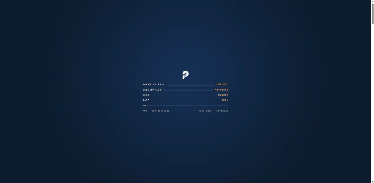
First, check-in. The screen goes to night blue and a boarding pass is verified line by line: boarding pass checked, destination anywhere, seat window, gate open.
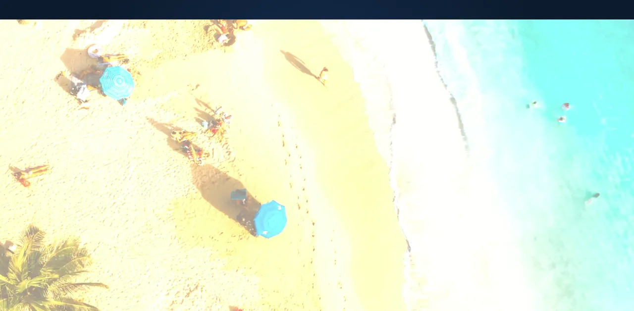
Then the first glimpse: a sunlit beach seen from the air, labelled "somewhere sunny, altitude 1,200 ft, descending". And then you land on the gate itself.
The homepage opens on a destination film, Positano, Hallstatt and others, each with its real local time and coordinates in the corner. The headline reads "Less planning. More let's go", and the last words keep changing language as the films change: vámonos, allons-y, andiamo, los geht's. Over Hallstatt, it answers in German.
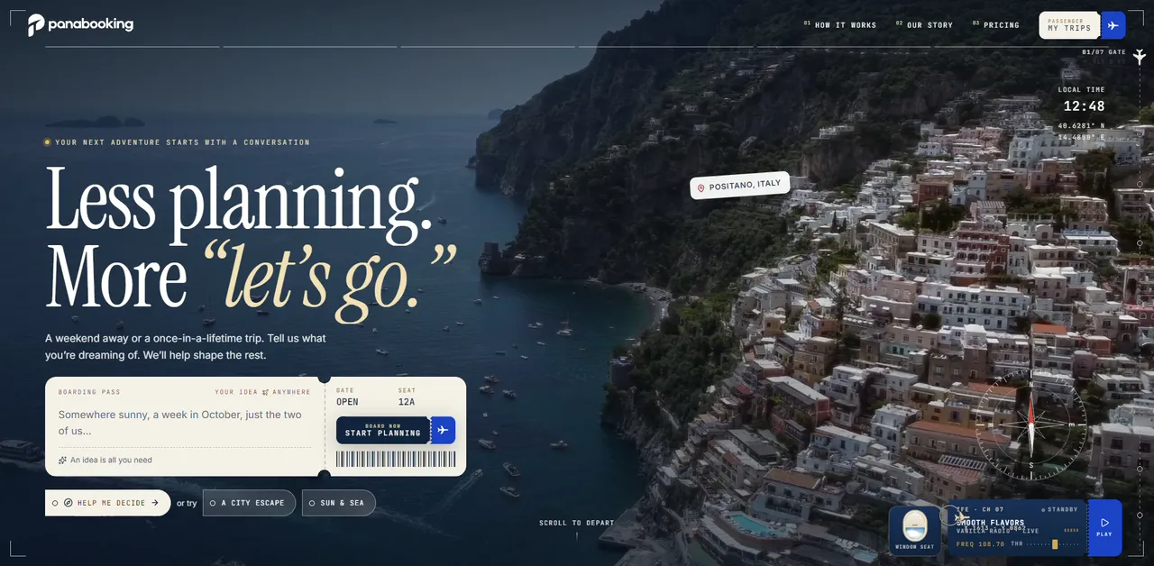
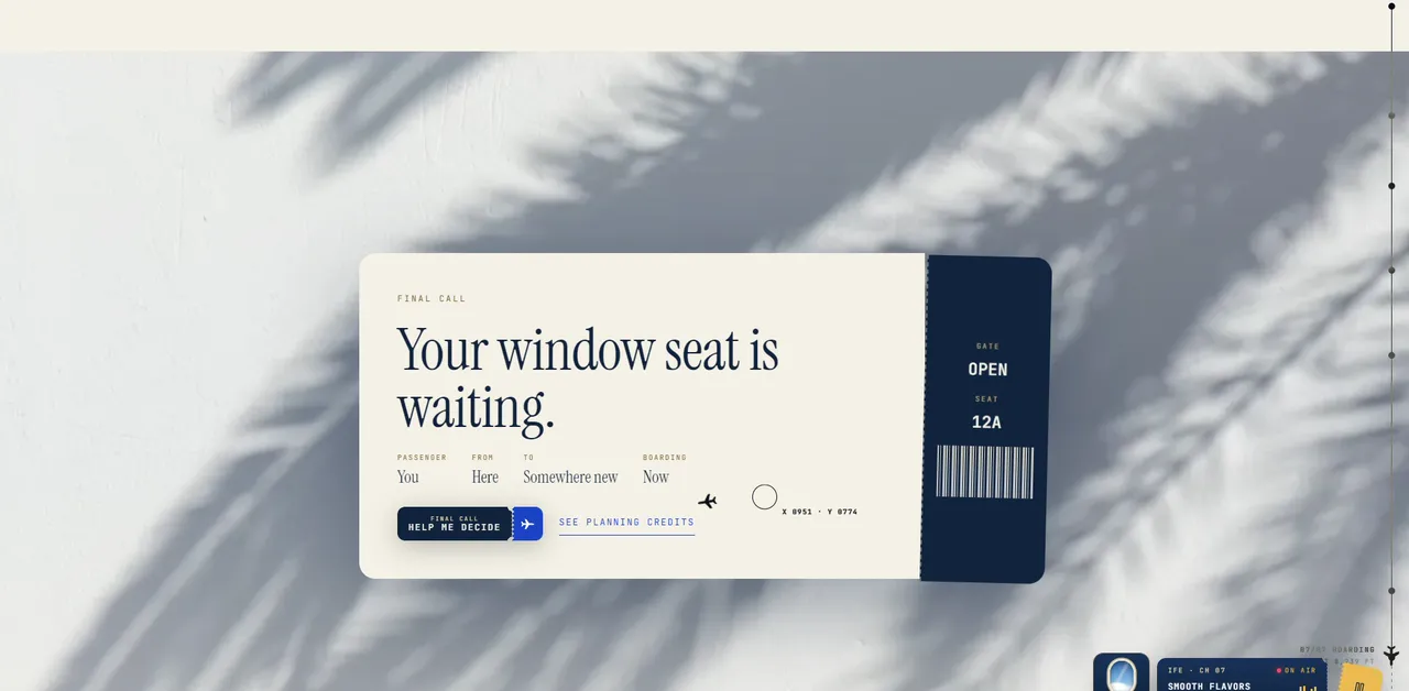
The place where you type your idea is a boarding pass, complete with gate, seat 12A and a barcode. "An idea is all you need," it says underneath. That is the whole invitation: not a form to fill in, just the first sentence of a trip.
05
The design language
The palette comes straight from travel documents and the sky they take you into.
- Paper and ink. Warm off-white paper and a deep navy ink, the colours of a passport page and a printed ticket.
- Night. A darker navy for the moments in the air: the check-in, the departures board, the footer.
- Gold and champagne. For the moments of anticipation, like the italic words in the headlines.
- Amber. For highlights and little ticket stubs, the colour of late-afternoon sun.
- Signal blue and stamp red. Blue for things you can act on. Red for the ink of a stamp.
The type follows the same logic, with three voices. An editorial serif with real italics carries the emotion: the headlines, and the words you would say out loud, like let's go. A clean sans handles the interface. And a monospace speaks every label, gate number, local time and status, because that is how airports talk: small, uppercase and precise.
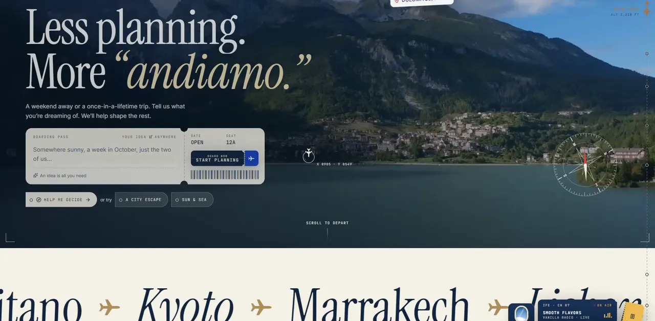
Then there are the objects. Scroll into check-in and the page fills with things from a travel bag: sunglasses, a shell, a straw hat, a passport, a compass, a camera, a luggage tag, a palm leaf. Destinations glide past in large serif type with small planes between them. It is the visual equivalent of packing, the moment a trip starts to feel real.
06
Moments along the way
A metaphor gets remembered through its moments. These are a few of my favourites.
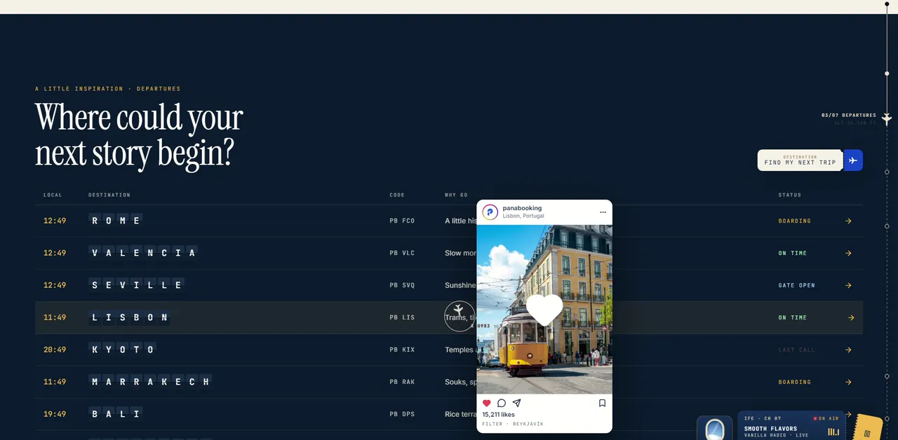
The departures board. "Where could your next story begin?" Rome, Valencia, Seville, Lisbon, Kyoto, Marrakech, Bali and Reykjavík are listed like flights, their names set letter by letter in tiles like an old split-flap board. Each has its live local time, a flight code, a one-line reason to go ("A little history. A lot of pasta.") and a status: boarding, on time, gate open, last call. Point at a row and the destination appears as a social post, likes and all, because let's be honest, that is how most trips are chosen now.
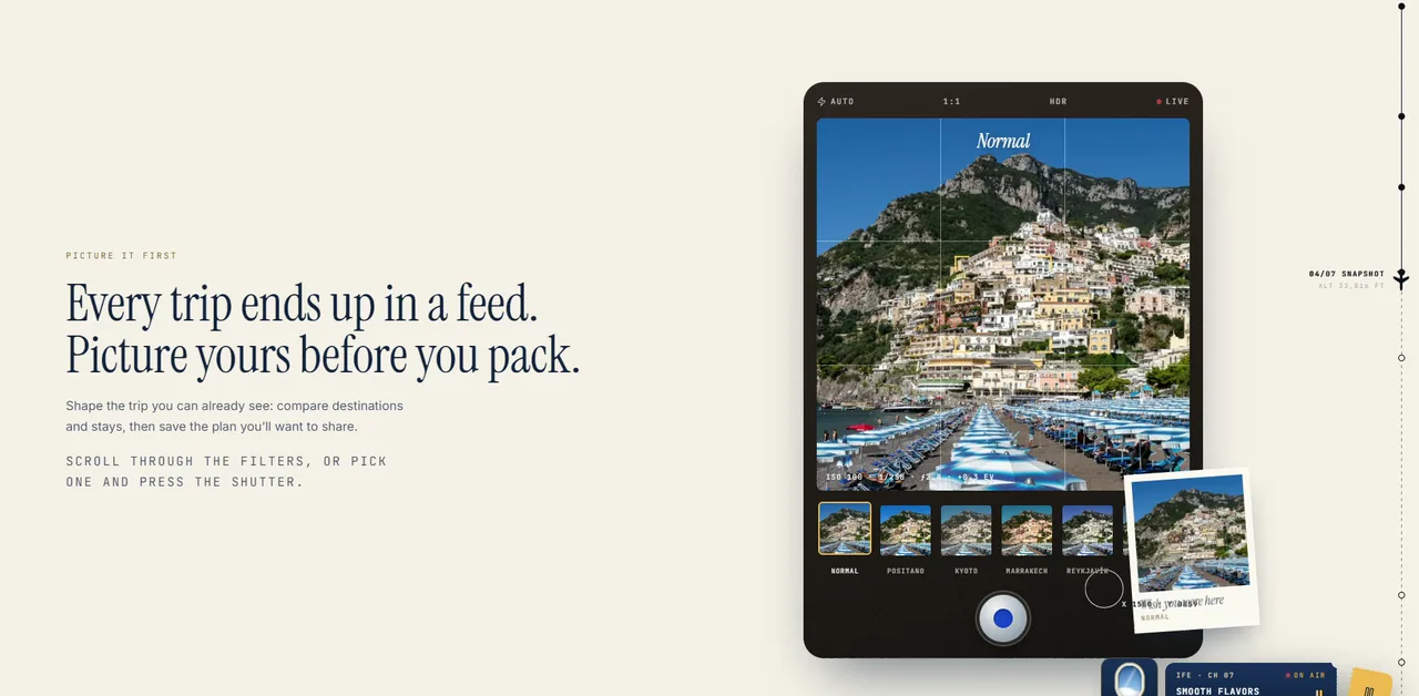
The viewfinder. "Every trip ends up in a feed. Picture yours before you pack." A camera screen previews a destination through filters named after places, Positano, Kyoto, Marrakech, Reykjavík, Havana, Lo-Fi Lisboa, and pressing the shutter takes the picture.
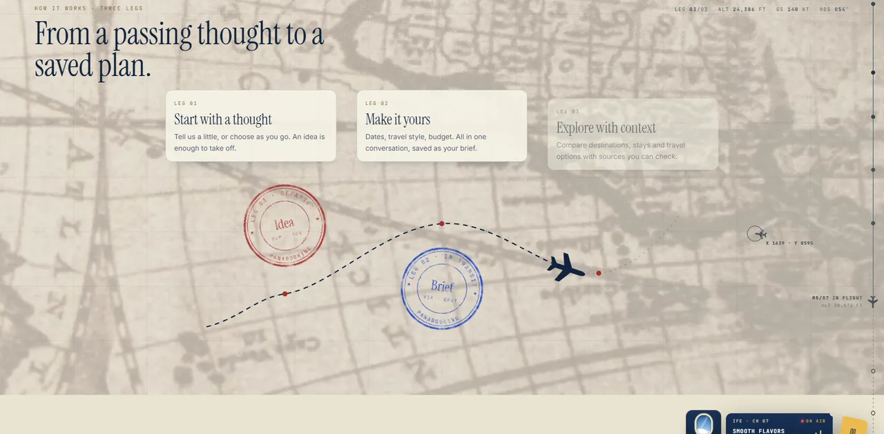
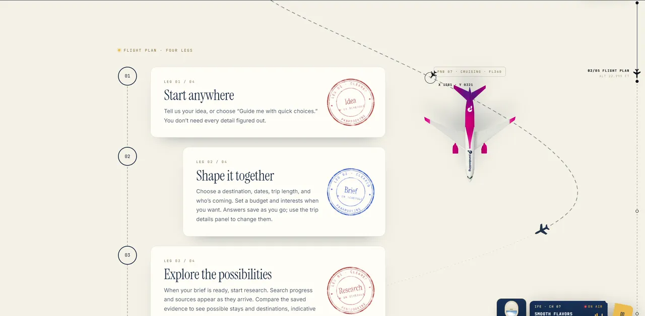
The legs. How it works is drawn as a flight path on an old paper map. A small plane flies the dotted line, and each step of planning is stamped as it passes: Idea, Brief, Plan, in red and blue ink. An instrument line above it reads like a cockpit: leg, altitude, ground speed, heading.
The passport. Your saved plan arrives stamped and saved, next to a passport whose machine-readable line spells out the trip: P<PNB<<AMALFI<COAST. It is a joke for the people who notice, and a quiet promise for everyone else: this plan is a real document you can come back to.
The final call. The page ends on a boarding pass laid on a table in the shade of a palm: "Your window seat is waiting." Passenger: you. From: here. To: somewhere new. Boarding: now.
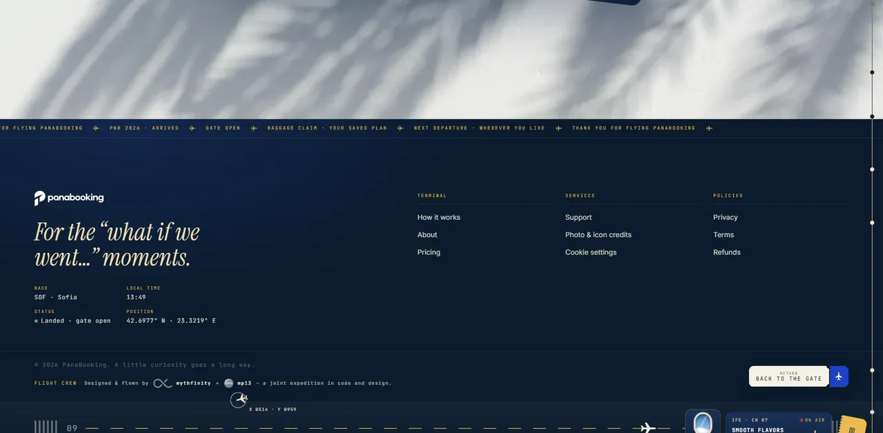
And there is a little in-flight entertainment: a radio player, styled as channel 07, playing Vanilla Radio. It is the same station that plays on mp13.eu. A small signature, carried from one project to the next.
07
Honest by design
Here is the part I am proudest of, and it is not an animation.
PanaBooking does not book anything, and the site says so plainly, in the questions people actually ask. Does it book flights or hotels? No. Are the prices guaranteed? No: research includes dated sources and indicative prices, and you check the original source before booking. The design never promises what the product doesn't do.
The same honesty runs through the pricing. Planning by guided choices is free. AI help and fresh research use planning credits: one credit for an AI message, ten to research a trip and build its shortlist, twenty free when you join, and a hundred for ten euros, with no subscription and nothing that renews. You see the cost before you start, the credits are held while the work runs, and they come back if it fails.
That matters for design because trust is a visual quality too. A site that feels slippery about money or limits loses people, however beautiful it is. Putting the plain answers where everyone can see them is part of making an AI product feel human.
08
A working platform under the theme
Underneath the flight there is a real product. You sign in to your own travel space. The trip brief saves as you talk, and you can change any detail later. Research shows its progress and its sources as they arrive. Plans, versions and research history stay together, so you can reopen a trip and compare options weeks later. Payments run through Stripe's hosted checkout.
Each inner page opens at its own gate with its own destination film and local time: the Dolomites for How it works, Positano for Our story, Lagos in Portugal for Pricing and Hallstatt for Support. Even the help desk feels like part of the journey.
09
Built together
PanaBooking is a joint expedition with Mythfinity, the team I also worked with on Solux Auto. The footer credits the flight crew: designed and flown by Mythfinity and MP13.
It is also a good example of how we work now: AI-coded, with a human touch and human design. A metaphor this thorough means hundreds of small pieces: split-flap letters, ink stamps, a passport line, an altimeter, gate numbers on every page, local clocks for eight cities. Not long ago, a small team would have had to pick a handful of those and let the rest go. Working with AI as part of the team, we could afford to follow the idea everywhere, and spend our time on the human part: deciding which details earn their place, and which ones to cut.
10
What I took from it
A few lessons I will carry to the next project:
- Commit to one idea. A metaphor followed all the way becomes a language. Half a metaphor is decoration.
- Give feelings their own typeface. The serif italics carry the excitement; the monospace carries the facts. Visitors feel the difference without being told.
- Let honesty be a design element. The plain answer to "does it book?" builds more trust than any badge.
- Hide rewards for the curious. The passport line, the local clocks, the radio. Most people won't notice them. The ones who do will remember the site.
- Never let the theme block the task. Every piece of theatre on PanaBooking still leads somewhere: board now, start planning, find my next trip.
11
Your window seat is waiting
The result is live at panabooking.com. Start with an idea, any idea, and see where it takes you. You can also see the project in our portfolio, with a full walkthrough, on the PanaBooking case study.
And if you have a product that deserves a story of its own, tell me about it. Boarding is open.