What lies ahead — 05
Health from nature: designing a pharmacy that isn't sterile
Most pharmacy websites look like a warehouse and feel like a waiting room. Soler is a boutique pharmacy in Plovdiv that believes in health from nature and a personal word from the pharmacist, so its site had to feel like that too. This is how we designed a pharmacy that breathes.
01
The sterile template
Open almost any pharmacy website and you know what you will find before it loads. A white page with a clinical blue. A carousel of discount banners. Rows of identical product shots on white. Red percentage badges shouting from every corner. A stock photo of capsules spilling out of a bottle.
It works, in the way a warehouse works. You can find a box and buy it. But nothing about it tells you who is behind the counter, whether anyone will help you choose, or why you should trust this pharmacy over the one on the next street. It is a catalogue wearing a lab coat.
Soler is not that kind of pharmacy. It is a boutique pharmacy in Plovdiv with a personal approach, a range that runs from medicines and supplements to homeopathy, herbs and dermocosmetics, and pharmacists who would rather ask you a question than push a product. If the site had looked like every other pharmacy online, it would have hidden the very thing that makes them different.
So the first decision was simple to say and harder to do: no sterile template. Not a single element taken from the usual pharmacy kit.
02
Starting from their own words
Before any colour or typeface, we listened to how Soler talks about itself.
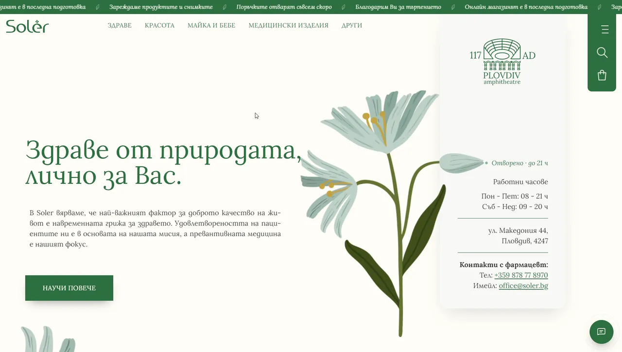
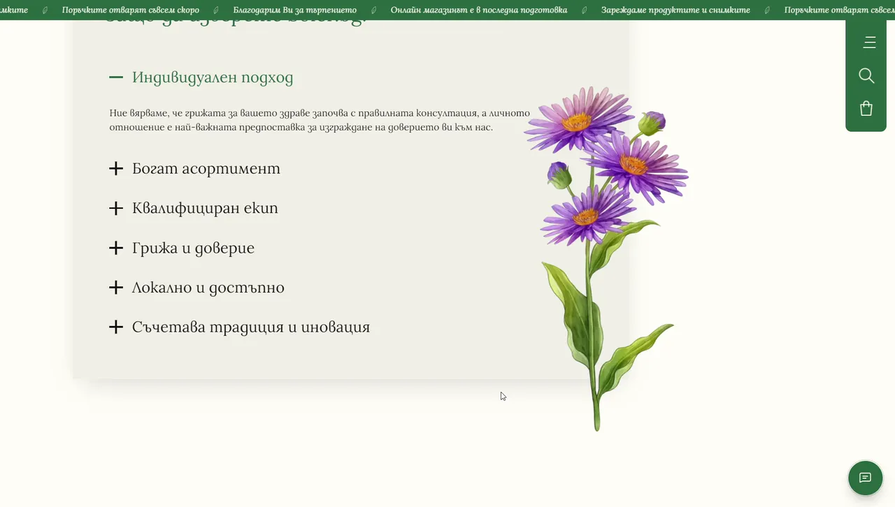
Their line is "Здраве от природата, лично за Вас." In English: health from nature, personally for you. Their mission says that timely care for your health is the most important factor in a good quality of life, that patient satisfaction is at the heart of what they do, and that their focus is prevention. And they describe themselves through six values: an individual approach, a rich range, a qualified team, care and trust, being local and accessible, and combining tradition with innovation.
Read those words together and the brief writes itself. Natural, not clinical. Personal, not anonymous. Calm, not loud. And holistic: health as something that involves the whole person, their skin, their family, their home and their habits, not a list of products to put in a basket.
03
A holistic idea of care
"Holistic" is an easy word to put in a brochure. In design it means something specific: the site looks after the whole visit, not just the sale.
So the first thing you see is not a promotion. It is the pharmacy's line, its opening hours, the address on Makedonia Street, and a direct line to the pharmacist by phone and e-mail. A live status tells you whether the pharmacy is open right now. Questions are welcome before anything is bought.
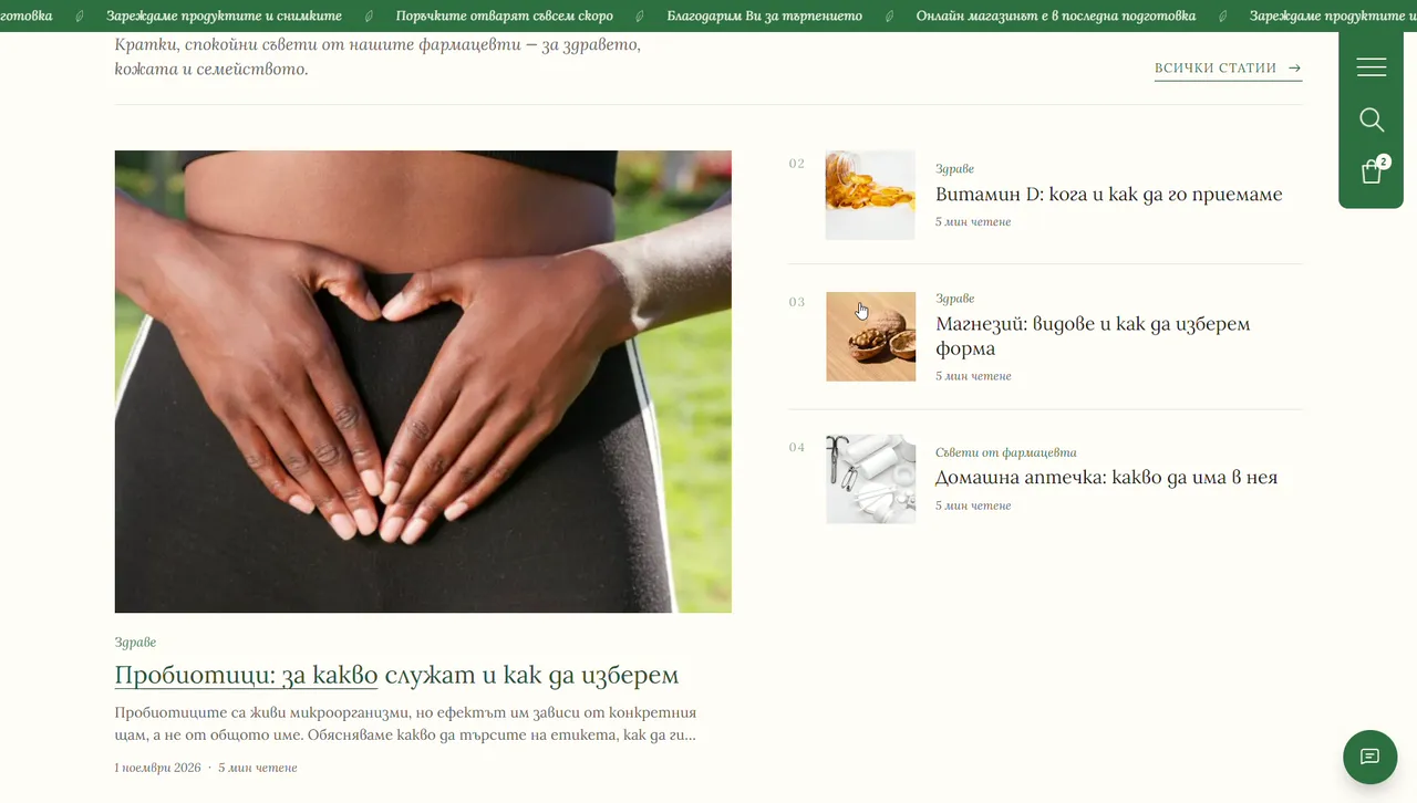
The same thinking runs through the rest of the page. Advice sits next to products: a section of reading from the pharmacy offers "short, calm advice from our pharmacists — for health, skin and the family", with articles on probiotics, vitamin D, magnesium and what to keep in a home first-aid kit, each a five-minute read. The shop is there, and it is a serious one, but it is part of a relationship, not the whole of it.
04
The palette of a herb garden
The colours came from the same place as the words. The ground is a warm cream, closer to the page of an old book than to a clinical white, with soft sand and mist tones for the panels. The one strong colour is a deep pharmacy green, the green of leaves and of the pharmacist's cross, used for headings, buttons and the menu. A darker green gives depth.
What is missing matters as much. There is no clinical blue anywhere. There is no sale red. The only warm accent is a muted terracotta, kept for alerts, so even a warning feels considered rather than alarming.
The effect is quiet. Nothing competes for attention, so the products, the photographs and the drawings can do the talking.
05
One serif, like a book of remedies
Most shops pair a display face with a neutral sans for the interface. Soler uses one typeface for everything: Lora, a serif with soft, calligraphic curves, from the huge headline down to the body text and the buttons.
It changes the whole register of the site. A serif reads like a book, and a single serif throughout reads like one book: an old herbal, a remedy manual, something written by a person. It is set with the Bulgarian letterforms that local readers grew up with, which makes it feel even more at home.
The headline arrives the way handwriting would: letter by letter, settling into place. It sets the pace for everything after it: calm, deliberate and unhurried.
06
Drawn, not stocked
The most important decision was to draw.
Hand-painted botanical illustrations grow along the edges of the pages: a tall lily beside the opening line, echinacea, asters and medicinal herbs further down. They are not decoration added at the end. They are the brand's voice made visible, the "from nature" in "health from nature".
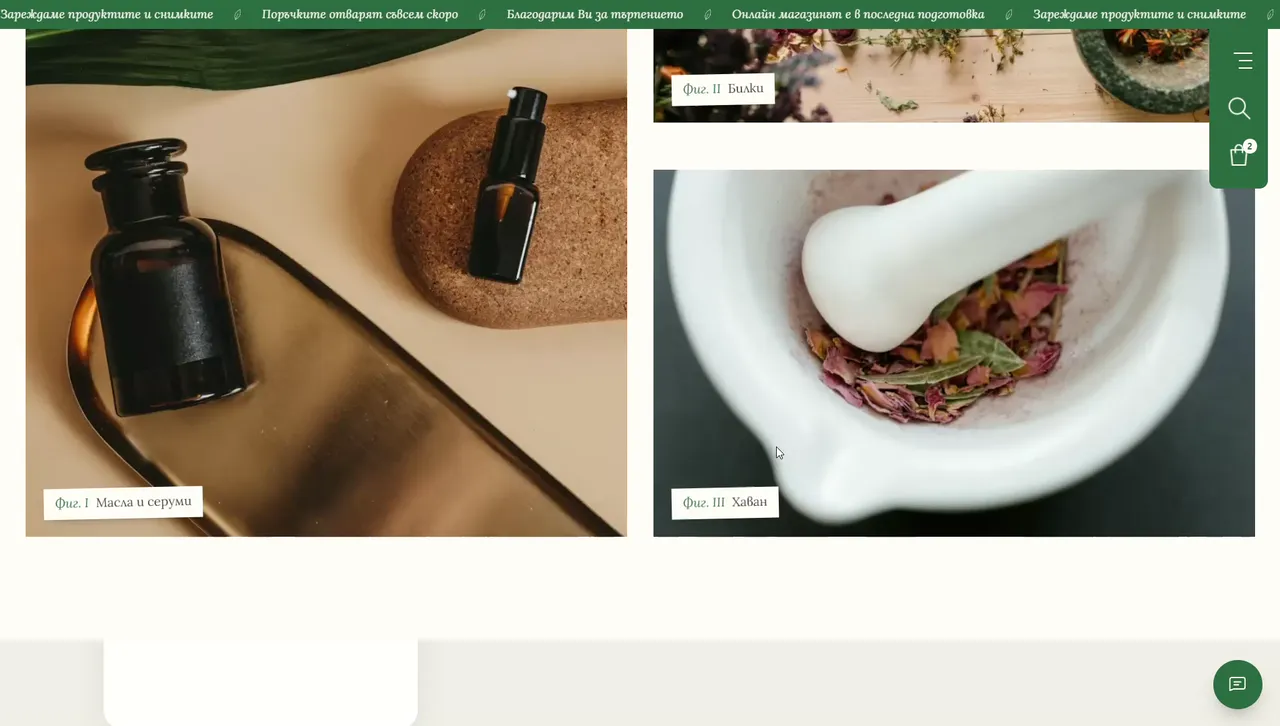
Where photographs appear, they are chosen the same way. Glass vials of herbal extracts, a mortar and pestle full of dried flowers, oils and serums in dark glass, long hair in the sun among green leaves. And they are captioned like plates in a botanical book: "Fig. I — Oils and serums", "Fig. II — Herbs", "Fig. III — Mortar". It is a small typographic joke, and it does a lot of work: it makes the photographs feel collected, not bought.
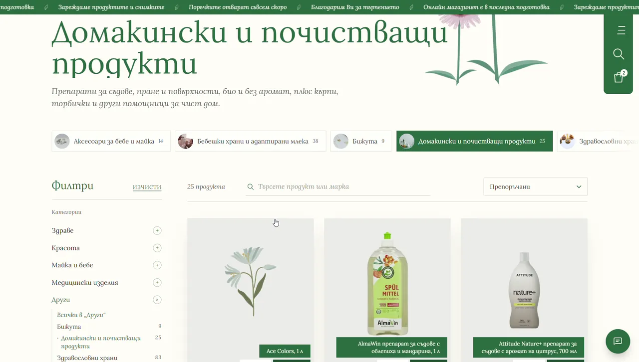
There is even a drawing where most shops would show a grey box. The catalogue is synced, but the product photos are still being synced as I write. Until a product has its photograph, it shows a small botanical drawing instead of an empty frame. Even the gaps look intentional.
07
Chapters, not banners
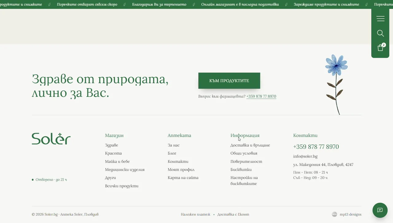
A template homepage is a stack of banners: hero, offer, offer, category grid, newsletter. Soler's homepage reads like a book instead, in numbered chapters with Roman numerals. II, the pharmacy. III, the range. IV, why Soler. V, the bestsellers. VI, the shelves. Then the reading from the pharmacy, and a footer that repeats the line you started with.
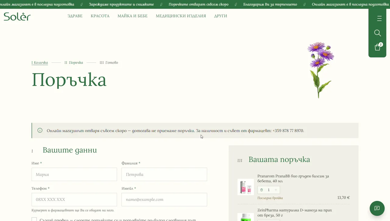
The numbering carries all the way to the checkout, which runs in three chapters of its own: I, the basket; II, the order; III, done. It is a small thing, but it means the most functional page on the site still speaks in the same voice as the most beautiful one.
08
Care you can see
The natural mood would mean little if the shop were hard to use, so the details are where the holistic idea becomes practical.
The menu opens each of the five departments, Health, Beauty, Mother and baby, Medical devices and Other, with a photograph, a sentence about what you will find, and every subcategory. Even the subcategories have their own gentle images rather than packshots: a cup of chamomile tea for herbal teas, ginger and honey for immunity, a sprig of lavender, a green apple wrapped in a tape measure for diet. You recognise what you need before you read it.
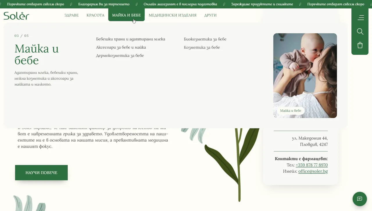
Search answers as you type, with a price beside each result, so you know straight away whether the pharmacy has what you came for. The shelves show what the pharmacists picked today, department by department. Prices are clear and in euro. And on the card with the opening hours sits a small emblem of Plovdiv's ancient amphitheatre, a quiet reminder that this is a local pharmacy with a street address, not an anonymous warehouse.
09
Calm is a business decision
People rarely visit a pharmacy website for fun. They come with a cough, a worried parent's question, a rash that will not go away, a medicine they need to understand. Many of them arrive a little anxious. A page full of flashing discounts adds noise to a moment that already has enough of it.
A calm page does the opposite. Space and soft colour lower the temperature. A real address and a pharmacist's phone number say that a person is there. Advice that comes before the sale says that the pharmacy cares whether you buy the right thing, not just something. That is how trust is built at the counter, and it is how it is built online too.
It is also simply good business. A customer who trusts their pharmacy comes back, asks again and recommends it to a friend. A customer who was shouted at buys once, at the lowest price they can find. For a boutique pharmacy competing with the big chains, the relationship is the advantage, and the design has to protect it rather than trade it for one more banner.
10
A real shop under the calm
None of this is a mood board. Underneath the cream and the drawings runs a full online shop.
The product catalogue is already synced and runs to 163 pages, with filters by department and category, and a carousel of bestsellers with prices and a buy button on every product. Checkout is built for how Bulgaria actually shops: delivery to an Econt office, to an Econt locker or to a home address, and cash on delivery.
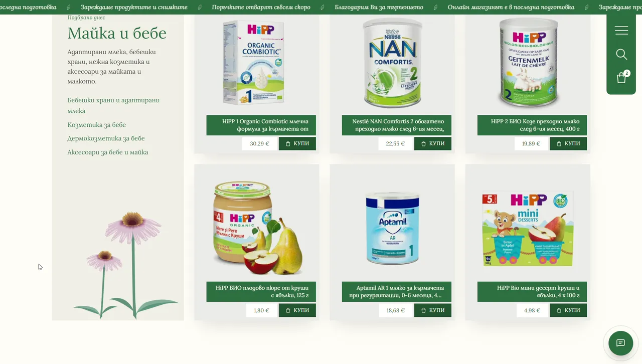
And it is honest about where it stands. A slim green ticker across the top of every page says that the online shop is in its final preparation, that the products and photos are being loaded, and that orders open very soon. The checkout repeats it and offers the pharmacist's number for availability and advice in the meantime. Saying "not yet" plainly is part of the same personal approach: the site never pretends to be further along than it is.
One more detail, for the people who notice these things: the motion on Soler uses the same easing curve as this site. A small signature, carried from one project to the next.
11
What I took from it
A few lessons I will keep:
- Start from the client's own words. "Health from nature, personally for you" did more for this design than any trend board could.
- Calm is an advantage in a category that shouts. When every competitor uses badges and banners, the quiet site is the one people remember.
- Draw instead of buying stock. Illustration gives a brand a voice that a stock photo never will.
- One typeface can be enough. A single serif, used well, made the whole site read like one book.
- Let the interface be honest. A ticker that says "orders open soon" builds more trust than a fake "in stock" ever could.
- Keep it local. An amphitheatre emblem and a street address remind people there is a real pharmacy, and real people, behind the screen.
12
Visit the pharmacy
Soler is live at soler.bg, with orders opening very soon. You can see the full walkthrough in the Soler.bg case study.
And if your business is drowning in a template that looks like everyone else's, tell me about it. There is always a version of your site that only you could have.