What lies ahead — 02
Dark glass and quiet luxury
Not every site should shout. Some of the work I am proudest of is quiet: deep, dark grounds, frosted glass, slow motion and one accent colour. This is how we design elegant, smooth websites, and why restraint is harder than it looks.
01
The look you are probably looking at
If you are reading this in the default look of this site, you are looking at dark glass. Every panel is a pane of frosted glass floating over moving film. The ground is a deep navy, almost black. Headlines are Montserrat at its heaviest weight, set in capitals; the text you are reading now is the same family at its lightest. The colour comes from the films behind the glass, not from the interface.
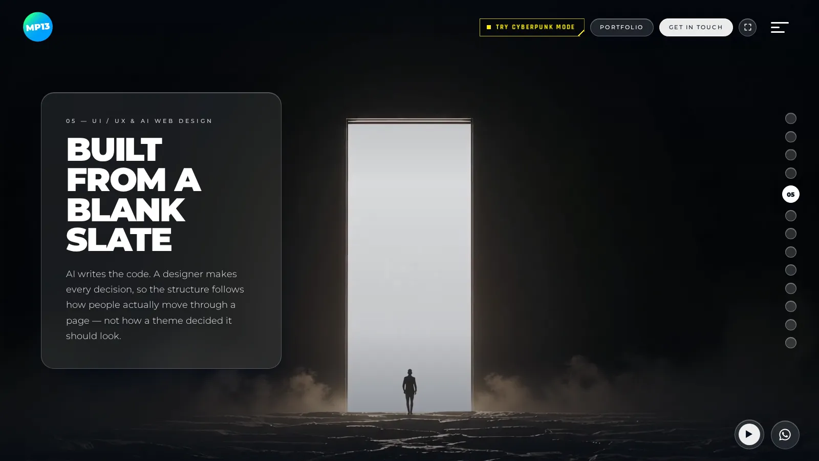
The rule I work by is simple: austere where it stands still, generous where it moves. The static design uses almost nothing: white, a dark ground and one accent. The budget goes into motion: the footage, the transitions, the way a panel arrives and the way it leaves.
02
Why glass
Glass solves a real problem. Video backgrounds are beautiful, and terrible for reading. The usual fix is a scrim, a dark layer over the whole film so the text stays legible. It works, and it kills the film.
Frosted glass does the opposite. The footage stays at full strength everywhere except directly behind the words, where it softens into a blur of its own colours. The panel carries its own legibility, so the scene never has to be dimmed for it. You still see the clouds move, the light change, the figure walking towards the open door. Just not behind the sentence you are reading.
It also feels physical. A good glass panel has a thin bright edge along the top, like light catching a bevel, a soft shadow beneath it, and a slight lift in saturation, so the colours behind it glow instead of turning grey. Get one of those wrong and the glass looks like a grey box. Get all three right and people want to touch it.
The tint is a dial, not a fixed setting. Short labels can sit on almost clear glass. Long reading needs more contrast, so on this blog the glass is a shade darker than on the homepage, enough to hold a paragraph steady over a bright sky without hiding the film. The film still moves behind every word; your eyes simply stop having to work for it. Elegance that is hard to read isn't elegance.
03
Choosing the film behind the glass
Glass is only as good as what is behind it, so the footage is chosen as carefully as any typeface.
A good background film for this kind of site moves slowly. The camera drifts rather than cuts, so the eye can rest on it. It has calm areas, a sky, a wall, a field of shadow, where the glass panels can sit without fighting a busy detail. It carries one dominant colour, which then becomes the colour of the whole screen once the glass picks it up. And it loops without a visible jump, because a film that stutters every ten seconds breaks the spell faster than any bad font.
Every film also gets a second cut for phones. A portrait phone only shows a narrow slice of a wide film, so instead of sending the whole frame and throwing most of it away, the site sends just that slice, at the same sharpness. Phones download about half as much, and where it matters, the slice can be moved off-centre by hand so the face or the figure stays in frame.
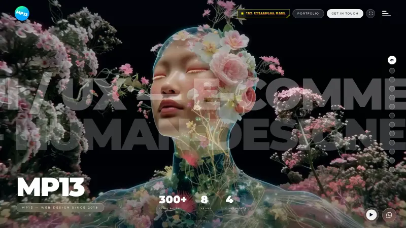
The films change with the content. The homepage moves through thirteen scenes, each with its own film: a face blooming with flowers for the opening, a door of light for the section about starting from a blank slate, a woman looking out over the clouds at a planet rising for the work. This blog opens on that last one. It seemed right for a page called What lies ahead.
04
Smooth is a feeling, not a feature
Visitors rarely say "the easing curves are lovely". They say the site feels expensive. That feeling is built from a hundred small decisions:
- Scrolling is smoothed, so the page glides instead of jumping in steps.
- Every movement shares one curve: a quick start and a long, soft landing. When everything slows down the same way, the site feels like one object rather than a collection of effects.
- Buttons fill from the left on hover, like ink spreading, instead of switching colour.
- The cursor is a small lens. It swells and clears over anything you can click, and leaves faint ripples behind it, like a finger drawn across water.
- Even the logo floats. It rocks gently, like something on the surface of a lake, and steadies when you hover over it.
None of these is remarkable on its own. Together they create the sense that someone cared about every millisecond, which is exactly the message a premium brand wants to send.
05
Type that whispers and type that shouts
The typography does a lot of quiet work. Headlines are set in capitals at the heaviest weight of the family, tightly spaced, so a short phrase lands like a statement. Body text is the same family at its lightest weight, with generous line spacing, so long reading feels light rather than dense.
Between the two sits a third voice: the small labels. The section numbers, the eyebrows above the headlines, the captions under images. They are tiny, uppercase and spaced very wide, almost like engraving on a watch face. They do the navigation without ever asking for attention. "01 — The brief" tells you where you are; the headline below tells you what matters.
That three-voice system means the page never needs boxes, icons or colour to explain its structure. Size, weight and spacing do it all, and that is a large part of why the design feels calm.
06
The details nobody asks for
Some of the things people remember about this site are not on any brief.
There is a small radio player in the corner. It is off until you press play, and then it streams a lounge station with a choice of moods: Smooth, Fresh and Deep. It never starts on its own, because sound nobody asked for is the fastest way to lose a visitor. But for someone browsing the work on a quiet evening, it turns a website into a place to spend a few minutes.
There is a WhatsApp button that opens a small glass panel with a message already started: "Hey, I like your style, I want to ask about…". Writing the first line is the hardest part of getting in touch, so the site writes it for you.
There is a fullscreen button, because a site built around film deserves to be seen without the browser around it. And on longer pages, the browser's scrollbar is replaced by a slim glass pill that matches everything else.
None of these sells a website directly. All of them say the same thing: someone thought about how this feels to use, down to the corners. For a premium brand, that is the message.
07
Showing the work, not listing it
The featured work on the homepage is a carousel built like a ring turning on a horizontal axis. Projects rise from below, square up as they face you and tip away over the top. Each one plays a short loop of the real site, so you see the work moving, not a static thumbnail.
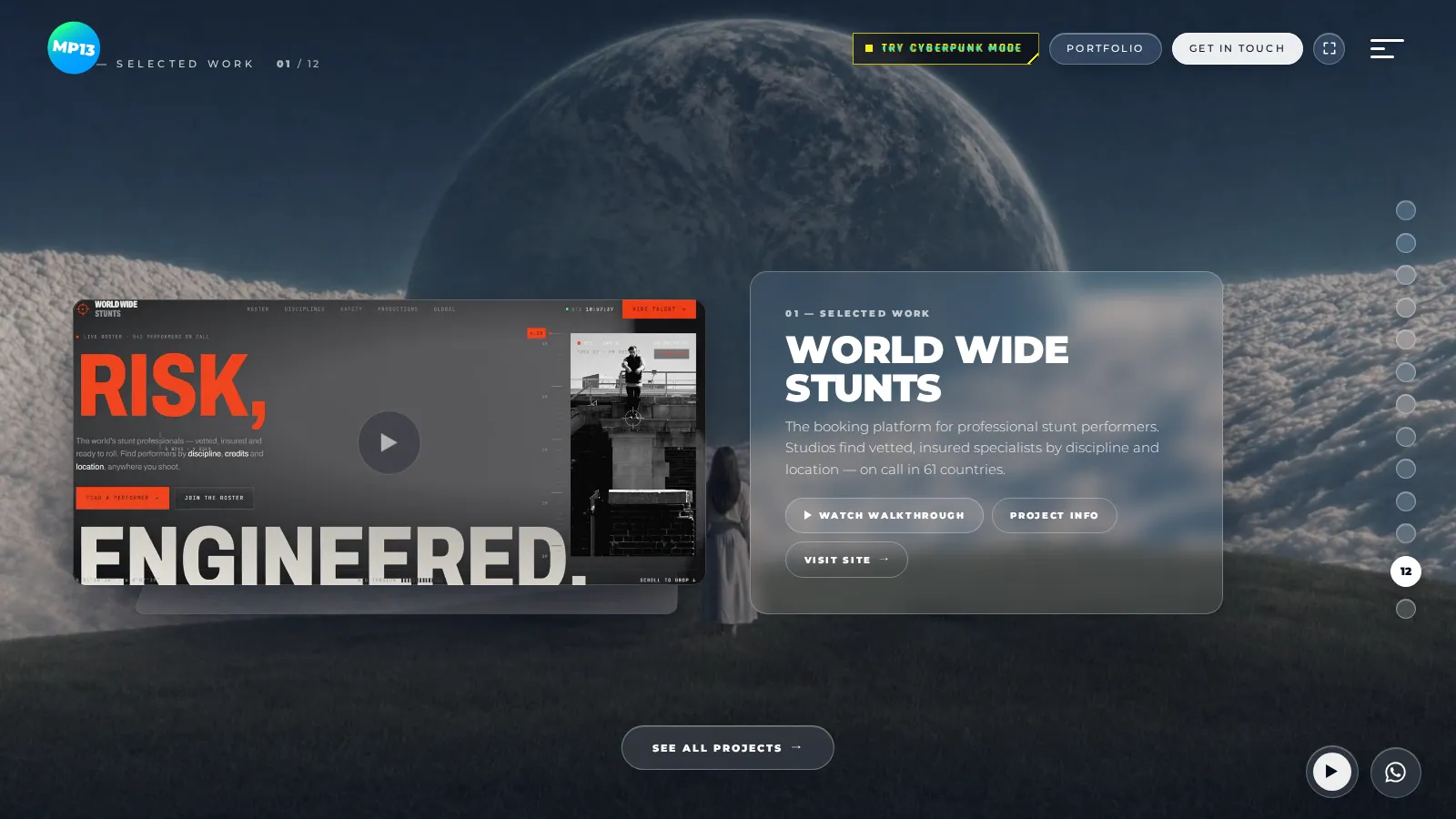
There is a lovely technical detail hidden here. Frosted glass blurs whatever is behind it, but on the web, the moment a container is rotated in 3D, the glass inside it can only blur what is inside that container. So the carousel cards were blurring an empty box, and they looked dead. The fix: every card sits in a cell that carries its own copy of the scene behind it, exactly the card's size and rounded to match. You never notice it. You simply see glass that behaves like glass.
That is what I mean by a human touch. The AI wrote that code in minutes. Noticing that the glass looked dead, and deciding that it mattered, is the designer's job.
08
Quiet luxury, beyond this site
Dark glass is my studio's own voice. But the principle behind it, restraint, space and slowness, runs through much of the work I do for clients. Different palettes, same discipline.
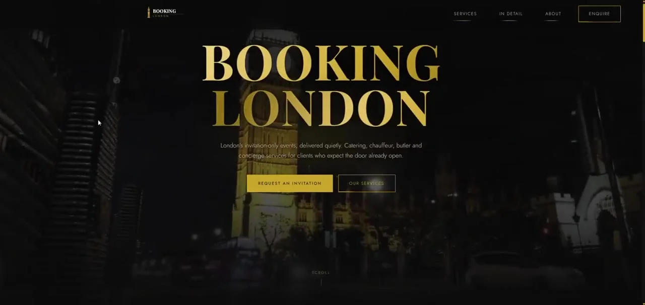
Booking London is a concierge for private clients: invitation-only events, fine dining, chauffeurs. The brief was discretion. The palette is London at night, near-black grounds with one gold accent and a large serif for the wordmark, and the main call to action is to request an invitation, not to buy. See the project.
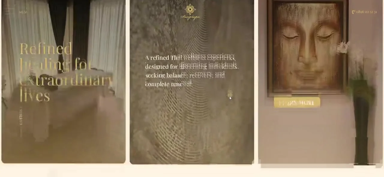
Sasiprapa is an exclusive Thai massage lounge in Sofia, and the site sells calm. Cream grounds, gold, italics for the big statements, and motion that stays slow and sparing. What it leaves out matters as much as what it shows. See the project.
The Pilates Club is a premium reformer studio in Boyana. Warm neutrals, soft blush and a delicate serif, with plenty of air around everything, because a studio that sells attention should look like it pays attention. See the project.
Radop Furniture sells Italian kitchens and made-to-measure furniture. The design steps back for the photography: light grounds, black, a warm gold accent and thin uppercase type with wide spacing. Quiet, so the kitchens speak. See the project.
Solux Auto is a premium car service: black, white and one signal red, heavy type and monochrome photography. Precision you can see. See the project.
Light or dark, gold or red, the same few rules hold.
09
The rules of elegant
If I had to write them on a card and pin it above the desk:
- One accent colour. Two if you must. Everything else is neutral, and the photography carries the colour.
- Space is a feature. Empty space tells the visitor that nothing here is desperate for attention.
- One type family, used at its extremes. Very heavy for headlines, very light for reading. Contrast creates hierarchy without decoration.
- Motion is slow and consistent. One easing curve, a touch longer than feels necessary.
- Say less. Short copy reads as confidence. A long list of features reads as worry.
- Every effect earns its weight. If it slows the page or distracts from the offer, it goes.
- Phones first, in practice. On this site every film has its own phone cut, the slice a portrait phone actually shows, so phones download about half as much and nothing important falls off the edge.
10
Restraint is harder than it looks
Here is the uncomfortable truth about minimal design: it has nowhere to hide. A busy layout can bury a weak decision under decoration. In a quiet one, every margin, every weight and every word is on display.
That is why elegant sites take so many small revisions: a little more space here, a slower fade there, a headline cut from eight words to four. Working with AI makes those revisions fast, which means I can make more of them, and more revisions is exactly what quiet design needs. But knowing when it is finished is still a human decision. Usually it is when there is nothing left to remove.
Minimal design has nowhere to hide. Every margin, every weight and every word is on display.
11
And then there is the other side
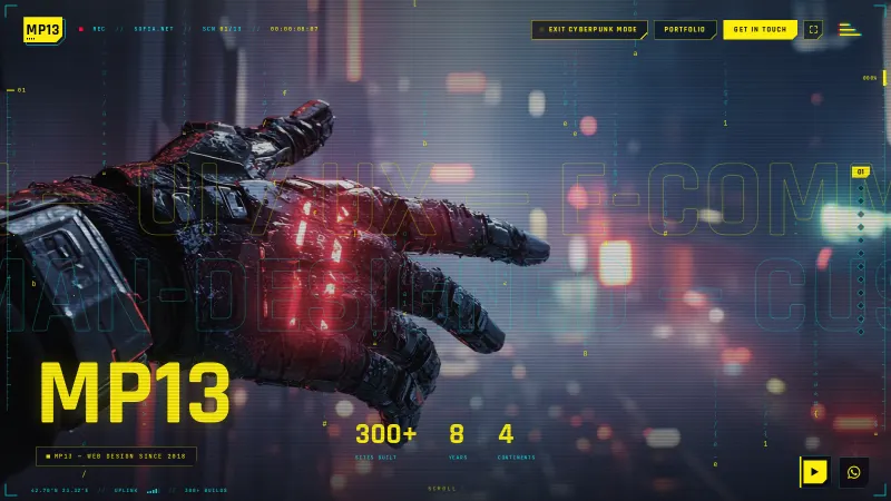
Restraint is one half of how I work. The other half breaks all of these rules on purpose. Press Try Cyberpunk Mode at the top of any page, and this same site turns into a neon heads-up display, with glitches, code rain and its own soundtrack. Same layout, a completely different soul.
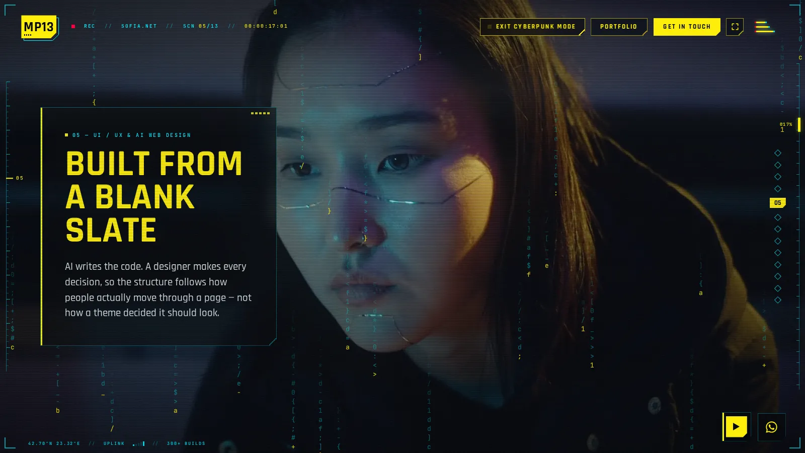
Both are me. Most clients need the quiet side. The loud side keeps me sharp. I have written about it in Cyberpunk mode: anatomy of a creativity outburst.
If your brand sells trust, calm or quality, the quiet side is probably where we start. Let's talk.